Button Groups
Button Groups
updated
- HTML/CSS Available
- Web Component Beta
- Last Updated
2.11.0
Button Groups join two or more buttons into a unified control, formerly called a segmented control.
Variations
Default
Use to create a mutually exclusive toggle. Buttons within the group follow the same visual and behavioral conventions as the secondary Button.
<div class="mds-button-group">
    <button class="mds-button mds-button--secondary"> Cyclical </button>
    <button class="mds-button mds-button--secondary"> Defensive </button>
    <button class="mds-button mds-button--secondary"> Sensitive </button>
</div>
<mds-button-group>
<mds-button variation="secondary">Cyclical</mds-button>
<mds-button variation="secondary">Defensive</mds-button>
<mds-button variation="secondary">Sensitive</mds-button>
</mds-button-group><div class="mds-button-group">
<button class="mds-button mds-button--secondary"> Cyclical </button>
<button class="mds-button mds-button--secondary"> Defensive </button>
<button class="mds-button mds-button--secondary" disabled> Sensitive </button>
</div><mds-button-group>
<mds-button variation="secondary">Cyclical</mds-button>
<mds-button variation="secondary">Defensive</mds-button>
<mds-button variation="secondary" disabled>Sensitive</mds-button>
</mds-button-group>Full Width
Use when you want the button group to span the full width of its container.
<div class="mds-button-group mds-button-group--justify">
    <label class="mds-button__input-outer-wrapper" for="cyclical--77136">
        <input id="cyclical--77136" class="mds-button__input" type="radio" name="html-radio" checked>
        <span for="cyclical--77136" class="mds-button mds-button--secondary"> Cyclical </span>
    </label>
    <label class="mds-button__input-outer-wrapper" for="defensive--86917">
        <input id="defensive--86917" class="mds-button__input" type="radio" name="html-radio">
        <span for="defensive--86917" class="mds-button mds-button--secondary"> Defensive </span>
    </label>
    <label class="mds-button__input-outer-wrapper" for="sensitive--6355">
        <input id="sensitive--6355" class="mds-button__input" type="radio" name="html-radio">
        <span for="sensitive--6355" class="mds-button mds-button--secondary"> Sensitive </span>
    </label>
</div>
<mds-button-group width="full">
<mds-button variation="secondary" type="radio" name="mdswc-radio" checked>Cyclical</mds-button>
<mds-button variation="secondary" type="radio" name="mdswc-radio">Defensive</mds-button>
<mds-button variation="secondary" type="radio" name="mdswc-radio">Sensitive</mds-button>
</mds-button-group>With Icons
Use Icons to provide additional affordance to a button.
<div class="mds-button-group">
    <label class="mds-button__input-outer-wrapper" for="filter--94023">
        <input id="filter--94023" class="mds-button__input" type="radio" name="html-radio-icon" checked>
        <span for="filter--94023" class="mds-button mds-button--secondary">
            <svg class="mds-icon mds-button__icon mds-button__icon--left" aria-hidden="true">
                <use xlink:href="/icons/mds.svg#funnel--s">
                </use>
            </svg>
            <span class="mds-button__text"> Filter </span>
        </span>
    </label>
    <label class="mds-button__input-outer-wrapper" for="upload--46711">
        <input id="upload--46711" class="mds-button__input" type="radio" name="html-radio-icon">
        <span for="upload--46711" class="mds-button mds-button--secondary">
            <svg class="mds-icon mds-button__icon mds-button__icon--left" aria-hidden="true">
                <use xlink:href="/icons/mds.svg#upload--s">
                </use>
            </svg>
            <span class="mds-button__text"> Upload </span>
        </span>
    </label>
    <label class="mds-button__input-outer-wrapper" for="search--92145">
        <input id="search--92145" class="mds-button__input" type="radio" name="html-radio-icon">
        <span for="search--92145" class="mds-button mds-button--secondary">
            <svg class="mds-icon mds-button__icon mds-button__icon--left" aria-hidden="true">
                <use xlink:href="/icons/mds.svg#search--s">
                </use>
            </svg>
            <span class="mds-button__text"> Search </span>
        </span>
    </label>
</div>
<mds-button-group>
<mds-button icon="funnel--s" variation="secondary" type="radio" name="mdswc-radio-icon" checked>Filter</mds-button>
<mds-button icon="upload--s" variation="secondary" type="radio" name="mdswc-radio-icon">Upload</mds-button>
<mds-button icon="search--s" variation="secondary" type="radio" name="mdswc-radio-icon">Search</mds-button>
</mds-button-group>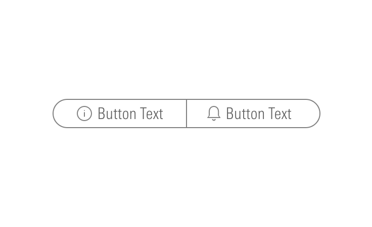
Icon Only
Use to create toolbars.
<div class="mds-button-group mds-button-group--icon-only">
    <button class="mds-button mds-button--icon-only" aria-label="Notifications">
        <svg class="mds-icon mds-button__icon mds-button__icon--left" aria-hidden="true">
            <use xlink:href="/icons/mds.svg#bell-padless">
            </use>
        </svg>
    </button>
    <button class="mds-button mds-button--icon-only" aria-label="Create New">
        <svg class="mds-icon mds-button__icon mds-button__icon--left" aria-hidden="true">
            <use xlink:href="/icons/mds.svg#create-padless">
            </use>
        </svg>
    </button>
    <button class="mds-button mds-button--icon-only" aria-label="Help">
        <svg class="mds-icon mds-button__icon mds-button__icon--left" aria-hidden="true">
            <use xlink:href="/icons/mds.svg#question-circle-padless">
            </use>
        </svg>
    </button>
    <button class="mds-button mds-button--icon-only" aria-label="My Acccount">
        <svg class="mds-icon mds-button__icon mds-button__icon--left" aria-hidden="true">
            <use xlink:href="/icons/mds.svg#person-padless">
            </use>
        </svg>
    </button>
</div>
<mds-button-group>
<mds-button icon="bell-padless" icon-title="Notifications"></mds-button>
<mds-button icon="create-padless" icon-title="New"></mds-button>
<mds-button icon="question-circle-padless" icon-title="Help"></mds-button>
<mds-button icon="person-padless" icon-title="My Account"></mds-button>
</mds-button-group><div class="mds-button-group mds-button-group--icon-only">
<button class="mds-button mds-button--icon-only">
<svg class="mds-icon mds-button__icon mds-button__icon--left">
<use xlink:href="/icons/mds.svg#bell-padless">
<title>Notifications</title>
</use>
</svg>
</button>
<button class="mds-button mds-button--icon-only">
<svg class="mds-icon mds-button__icon mds-button__icon--left">
<use xlink:href="/icons/mds.svg#create-padless">
<title>Create New</title>
</use>
</svg>
</button>
<button class="mds-button mds-button--icon-only mds-button--disabled" disabled>
<svg class="mds-icon mds-button__icon mds-button__icon--left">
<use xlink:href="/icons/mds.svg#question-circle-padless">
<title>Help</title>
</use>
</svg>
</button>
<button class="mds-button mds-button--icon-only">
<svg class="mds-icon mds-button__icon mds-button__icon--left">
<use xlink:href="/icons/mds.svg#person-padless">
<title>My Acccount</title>
</use>
</svg>
</button>
</div><mds-button-group>
<mds-button icon="bell-padless" icon-title="Notifications"></mds-button>
<mds-button icon="create-padless" icon-title="New"></mds-button>
<mds-button icon="question-circle-padless" icon-title="Help" disabled></mds-button>
<mds-button icon="person-padless" icon-title="My Account"></mds-button>
</mds-button-group>- Always include a
<title>within the svg tag to describe the intent of the button. - For single icons, use the icon-only Button component.
- Consider pairing with a Tooltip to describe the icon’s underlying action.
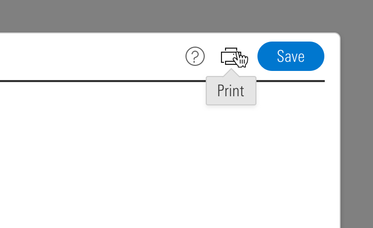 Icon-only Button Group paired with a tooltip.
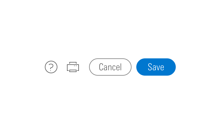
- When pairing with a button, use a
$mds-space-inline-right-2-xspace, and vertically align middle the icon-only button group.- When pairing with a small button, use the small icon-only Button.
 Icon-only Button Group alignment paired with a button.
Sizing
<div class="mds-button-group">
    <label class="mds-button__input-outer-wrapper" for="cyclical--43949">
        <input id="cyclical--43949" class="mds-button__input" type="radio" name="html-small" checked>
        <span for="cyclical--43949" class="mds-button mds-button--secondary mds-button--small"> Cyclical </span>
    </label>
    <label class="mds-button__input-outer-wrapper" for="defensive--67256">
        <input id="defensive--67256" class="mds-button__input" type="radio" name="html-small">
        <span for="defensive--67256" class="mds-button mds-button--secondary mds-button--small"> Defensive </span>
    </label>
    <label class="mds-button__input-outer-wrapper" for="sensitive--5380">
        <input id="sensitive--5380" class="mds-button__input" type="radio" name="html-small">
        <span for="sensitive--5380" class="mds-button mds-button--secondary mds-button--small"> Sensitive </span>
    </label>
</div>
<br><br>
<div class="mds-button-group">
    <label class="mds-button__input-outer-wrapper" for="filter--83664">
        <input id="filter--83664" class="mds-button__input" type="radio" name="small-with-icon" checked>
        <span for="filter--83664" class="mds-button mds-button--secondary mds-button--small">
            <svg class="mds-icon mds-button__icon mds-button__icon--left" aria-hidden="true">
                <use xlink:href="/icons/mds.svg#funnel--s">
                </use>
            </svg>
            <span class="mds-button__text"> Filter </span>
        </span>
    </label>
    <label class="mds-button__input-outer-wrapper" for="upload--52231">
        <input id="upload--52231" class="mds-button__input" type="radio" name="small-with-icon">
        <span for="upload--52231" class="mds-button mds-button--secondary mds-button--small">
            <svg class="mds-icon mds-button__icon mds-button__icon--left" aria-hidden="true">
                <use xlink:href="/icons/mds.svg#upload--s">
                </use>
            </svg>
            <span class="mds-button__text"> Upload </span>
        </span>
    </label>
    <label class="mds-button__input-outer-wrapper" for="search--14696">
        <input id="search--14696" class="mds-button__input" type="radio" name="small-with-icon">
        <span for="search--14696" class="mds-button mds-button--secondary mds-button--small">
            <svg class="mds-icon mds-button__icon mds-button__icon--left" aria-hidden="true">
                <use xlink:href="/icons/mds.svg#search--s">
                </use>
            </svg>
            <span class="mds-button__text"> Search </span>
        </span>
    </label>
</div>
<br><br>
<div class="mds-button-group mds-button-group--icon-only">
    <button class="mds-button mds-button--icon-only mds-button--small">
        <svg class="mds-icon mds-button__icon mds-button__icon--left" aria-hidden="true">
            <use xlink:href="/icons/mds.svg#search--s">
            </use>
        </svg>
    </button>
    <button class="mds-button mds-button--icon-only mds-button--small">
        <svg class="mds-icon mds-button__icon mds-button__icon--left" aria-hidden="true">
            <use xlink:href="/icons/mds.svg#heart--s">
            </use>
        </svg>
    </button>
    <button class="mds-button mds-button--icon-only mds-button--small">
        <svg class="mds-icon mds-button__icon mds-button__icon--left" aria-hidden="true">
            <use xlink:href="/icons/mds.svg#pencil--s">
            </use>
        </svg>
    </button>
</div>
<mds-button-group>
<mds-button type="radio" variation="secondary" size="small" name="mdswc-small" checked>Cyclical</mds-button>
<mds-button type="radio" variation="secondary" size="small" name="mdswc-small">Defensive</mds-button>
<mds-button type="radio" variation="secondary" size="small" name="mdswc-small">Sensitive</mds-button>
</mds-button-group>
<br><br>
<mds-button-group>
<mds-button icon="funnel--s" type="radio" variation="secondary" size="small" name="mdswc-small-icon" checked>Filter</mds-button>
<mds-button icon="upload--s" type="radio" variation="secondary" size="small" name="mdswc-small-icon">Upload</mds-button>
<mds-button icon="search--s" type="radio" variation="secondary" size="small" name="mdswc-small-icon">Search</mds-button>
</mds-button-group>
<br><br>
<mds-button-group>
<mds-button icon="search--s" size="small"></mds-button>
<mds-button icon="heart--s" size="small"></mds-button>
<mds-button icon="pencil--s" size="small"></mds-button>
</mds-button-group>Icon Size
Icon size is predetermined and applied automatically. To avoid undesirable scaling of icon artwork, use the chart below to choose the correct icon size to use in your button group.
|
Type |
Small |
Medium |
Large |
|---|---|---|---|
|
Default |
|||
|
Icon Only |
N/A |
Use When
- Toggling through content in an adjacent container.
- Switching units, currency, or increments.
Visual Language
- Always follows the same conventions as secondary Buttons.
Behaviors
- By default, the button group should start with its first item in the active state.
Editorial
- This component looks best when the content is balanced.
- Ideally, button labels should have the same number of words. Preferably one word each.
- When impossible, button labels should be within one word of each other, count wise.
- Do: Files / Forms & Reports
- Don't: Files / Market Commentary for Advisors / Reports
- See Buttons for more guidance.
Related UX Patterns
CSS
Class References
Web Component
Props
| Prop | Type | Validation | Default | Description |
|---|---|---|---|---|
|
|
String |
— |
— |
A space-separated list of class names that will be appended to the default |
|
|
String |
Required |
— |
Provides the content rendered inside the button group. |
|
|
String |
— |
— |
The |
|
|
String |
Enum: |
|
If |
Slots
Default Slot
Pass two or more Button custom elements between <mds-button-group></mds-button-group> to set the options in the button group.
Usage Examples
Passing in buttons:
<!-- Using Props -->
<mds-button-group content='<mds-button variation="secondary">New</mds-button> <mds-button variation="secondary">Popular</mds-button>'></mds-button-group>
<!-- Using Slots -->
<mds-button-group>
    <mds-button variation="secondary">New</mds-button>
    <mds-button variation="secondary">Popular</mds-button>
</mds-button-group>
Creating a toggle button group:
<!-- Using Props -->
<mds-button-group content='<mds-button type="radio" variation="secondary" name="mustmatch" value="one" checked>One</mds-button> <mds-button type="radio" variation="secondary" name="mustmatch" value="two">Two</mds-button>'></mds-button-group>
<!-- Using Slots -->
<mds-button-group>
    <mds-button type="radio" variation="secondary" name="mustmatch" value="one" checked>One</mds-button>
    <mds-button type="radio" variation="secondary" name="mustmatch" value="two">Two</mds-button>
</mds-button-group>
Browser Support
- This component uses a
box-shadowproperty to create an outline. Internet Explorer and Safari have known issues rendering these outlines when using the browser's zoom functionality. This visual defect doesn't affect the functionality of the component.
Implementation
- Include a
role="group"attribute for a default button group.- If a button group is used for navigation, set
role="navigation". - If a button group is being used as a toolbar, set
role="toolbar".
- If a button group is used for navigation, set
- Include an
aria-label="..."to describe the intention of the button group.- For example,
aria-label="View Toggle"could describe a button group set that changes the view of a content module below the button group.
- For example,
- See Buttons for more guidance.