Getting Started
The Morningstar Design System is a collection of brand, visual, UX, and technical standards built into a central library so that teams can quickly build high-quality, consistent experiences.
Overview
The System is organized into three primary sections: Visual Language, Libraries, and About MDS. Exploring these sections will help familiarize you with Morningstar design principles and patterns, and show you which existing components you can use in your product.
Visual Language
Visual Language contains the critical building blocks of the look and feel of Morningstar products. Here, you will find details and guidelines on Color, Typography, Iconography, and Space, defined as reusable variables called Constants. Constants are threaded throughout MDS components to maintain a consistent visual style.
Libraries
Libraries are collections of pre-built components, concepts, and guidelines that solve common design challenges in Morningstar products. To ensure consistency and reusability, components are built using Constants defined in the Visual Language section, and are accompanied by detailed documentation and guidelines for use.
About MDS
About MDS includes a plethora of useful information on topics like Accessibility, Contributing to MDS, Reporting Bugs, and the MDS team’s Development Process.
Sketch Design Assets
This Sketch file contains visual language elements and pre-built designs for each MDS component, defined as reusable symbols.
Sketch Library Setup
The Craft Library has been retired because Sketch added a native library feature, allowing you to define any .sketch file as a library and access all of its symbols from any file. Library symbols aren't added to your file's symbols page, so your file stays lean and updates to the library file are automatically synced across all files.
By hosting an MDS Sketch Library in a OneDrive folder, we can share a single, centrally managed library of symbols that will automatically update as we add new components and styles to MDS.
Follow the below steps to set up the MDS Sketch Library on your machine:
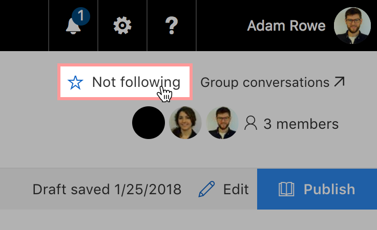
2. Go to the MDS Design Assets SharePoint page and click follow in the top right corner. This will add the group's shared files to your personal OneDrive page.
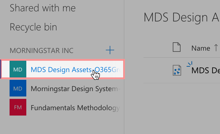
3. Head to your personal OneDrive page and click the MDS Design Assets group in the left navigation.
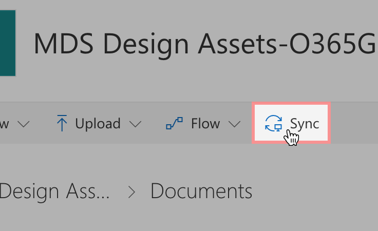
4. Click the Sync button in the toolbar to sync the MDS Design Assets folder to your machine. If you haven't installed OneDrive on your machine yet, you'll need to download the application through the App Store and follow the setup instructions.
5. In Sketch, open the preferences pane and navigate to the Libraries tab. Click Add Library... in the lower left corner and select the MDS Sketch Library file in the local OneDrive folder you set up in the previous step.
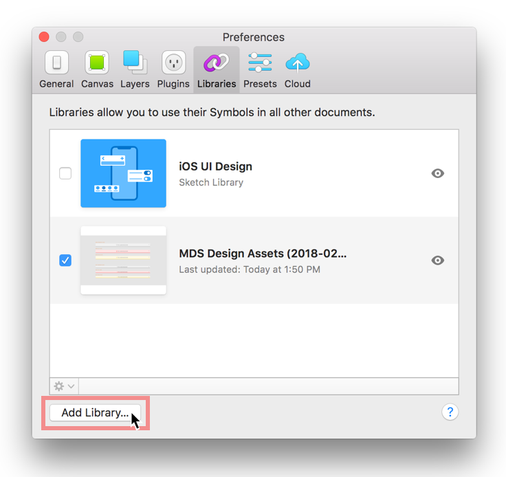
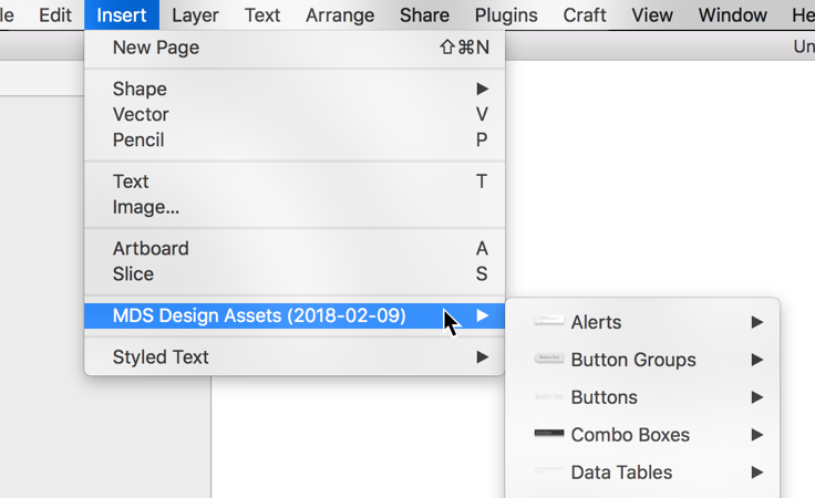
6. You're all set! You can now access all the MDS Sketch Library symbols in any file from the Insert menu.
Usage Tips
- If an update is available for the MDS Sketch Library, you will see a notification in the top right corner of Sketch. Click the message to review the updates and apply them to your files.
- If you double click a library symbol in your file you will see a dialog that says "This Symbol belongs to an external Library." Always choose
Unlink from Library. The shared MDS Sketch Library file is locked to prevent accidental editing. - To convert a library symbol into a folder with workable layers, right click the symbol and choose
Detach from Symbol.
Icon Creation Templates
Use these Adobe Illustrator templates when creating new icons for MDS.
Brand Guidelines
Morningstar's brand guidelines are documented on a separate documentation site where you can find details on topics such as:
- Brand philosophy
- Logo files and usage
- Print specifications
- Morningstar's intellectual property
- Presentation templates
- Event planning and design
The brand guide is password protected, if you need credentials to access these resources please reach out on Slack in the #design channel or email [email protected].
Overview
Installing MDS
Install MDS using Node package management (NPM).
Add an
.npmrcfile to your product (or update your existing one) with the following line:registry = https://msnexus.morningstar.com/content/repositories/npm-all/This will point your product to Morningstar‘s internal NPM server where the latest version of MDS can be retrieved.
Then, install MDS in your product via NPM:
npm install morningstar-design-system --save
Manually
If you cannot use NPM, install MDS by downloading a ZIP file containing the latest release. This process will be repeated each time you upgrade MDS.
Using MDS CDN
Load MDS styles externally by using Morningstar’s CDN service:
MDS v1
1.16.0 latest published on CDN
<link rel="stylesheet" href="https://mwc-cdn.morningstar.com/mc/morningstar-design-system/[version_number]/dist/docs/assets/styles/mds_library.css">
MDS v2
2.12.0 latest published on CDN
<link rel="stylesheet" href="https://mwc-cdn.morningstar.com/mc/morningstar-design-system/[version_number]/dist/mds.css">
Update [version_number] in the URL address to reflect the version of MDS you would like to load.
- Please note each major version of MDS has a different file path.
Using CSS
The easiest way to include MDS styles is by adding a link to the precompiled mds.css file:
<link rel="stylesheet" href="/path/to/mds.css">
In the NPM package this file is found at: /dist/mds.css
Font Paths
mds.css expects the MDS font files to be located at ../fonts. When adding mds.css to your product, place it in a directory at the same level as the directory containing the MDS fonts:
├── fonts
└── styles
    └── mds.css
Using SCSS
Use MDS source SCSS files to mix MDS constants, mixins and components with your own product‘s SCSS files.
Importing SCSS
You can @import individual MDS component SCSS files as needed. Each component's SCSS file will automatically include all the necessary visual-language and util SCSS files needed. For example, if your project needs MDS form elements and buttons, include:
/* your-project.scss */
@import 'node_modules/morningstar-design-system/components/form/form';
@import 'node_modules/morningstar-design-system/components/button/button';
To include all MDS components using full NPM package paths:
@import 'node_modules/morningstar-design-system/constants/constants';

@import 'node_modules/morningstar-design-system/styles/utils/accessibility';
@import 'node_modules/morningstar-design-system/styles/utils/import_once';
@import 'node_modules/morningstar-design-system/styles/visual-language/borders';
@import 'node_modules/morningstar-design-system/styles/visual-language/color';
@import 'node_modules/morningstar-design-system/styles/visual-language/fonts';
@import 'node_modules/morningstar-design-system/styles/visual-language/layering';
@import 'node_modules/morningstar-design-system/styles/visual-language/shape';
@import 'node_modules/morningstar-design-system/styles/visual-language/size';
@import 'node_modules/morningstar-design-system/styles/visual-language/space';
@import 'node_modules/morningstar-design-system/styles/visual-language/typography';

@import 'node_modules/morningstar-design-system/components/accordion/accordion';
@import 'node_modules/morningstar-design-system/components/alert/alert';
@import 'node_modules/morningstar-design-system/components/article/article';
@import 'node_modules/morningstar-design-system/components/button/button';
@import 'node_modules/morningstar-design-system/components/button_group/button_group';
@import 'node_modules/morningstar-design-system/components/card/card';
@import 'node_modules/morningstar-design-system/components/combo_box/combo_box';
@import 'node_modules/morningstar-design-system/components/container/container';
@import 'node_modules/morningstar-design-system/components/data_table/data_table';
@import 'node_modules/morningstar-design-system/components/dialog/dialog';
@import 'node_modules/morningstar-design-system/components/exhibit/exhibit';
@import 'node_modules/morningstar-design-system/components/form/form';
@import 'node_modules/morningstar-design-system/components/header/header';
@import 'node_modules/morningstar-design-system/components/icon/icon';
@import 'node_modules/morningstar-design-system/components/layout_grid/layout_grid';
@import 'node_modules/morningstar-design-system/components/link/link';
@import 'node_modules/morningstar-design-system/components/list_group/list_group';
@import 'node_modules/morningstar-design-system/components/loader/loader';
@import 'node_modules/morningstar-design-system/components/masthead/masthead';
@import 'node_modules/morningstar-design-system/components/menu/menu';
@import 'node_modules/morningstar-design-system/components/modal/modal';
@import 'node_modules/morningstar-design-system/components/module_container/module_container';
@import 'node_modules/morningstar-design-system/components/navigation_container/navigation_container';
@import 'node_modules/morningstar-design-system/components/notification/notification';
@import 'node_modules/morningstar-design-system/components/page_shell/page_shell';
@import 'node_modules/morningstar-design-system/components/pagination/pagination';
@import 'node_modules/morningstar-design-system/components/popover/popover';
@import 'node_modules/morningstar-design-system/components/profile_image/profile_image';
@import 'node_modules/morningstar-design-system/components/range_slider/range_slider';
@import 'node_modules/morningstar-design-system/components/search_field/search_field';
@import 'node_modules/morningstar-design-system/components/site_navigation/site_navigation';
@import 'node_modules/morningstar-design-system/components/stepper/stepper';
@import 'node_modules/morningstar-design-system/components/switch/switch';
@import 'node_modules/morningstar-design-system/components/tag/tag';
@import 'node_modules/morningstar-design-system/components/tooltip/tooltip';
@import 'node_modules/morningstar-design-system/components/top_hat/top_hat';
Overriding MDS Styles with SCSS
By controlling which SCSS files you @import into your product, you can control when and how you override the styles MDS provides. The MDS Core team expects products to override and modify imported SCSS files on an as-needed basis.
Font Asset Path
Override the default font asset path, ../fonts/, as needed by setting the $mds-font-asset-path variable before importing MDS fonts.
$mds-font-asset-path: 'my/path/to/fonts/';
@import 'node_modules/morningstar-design-system/styles/visual-language/fonts';
Applying Visual Style
Constants
MDS threads global variables, or Constants, throughout the component library for visual consistency. Use MDS constants as SCSS variables to apply the MDS Visual Language to your product‘s components.
- SCSS variables
node_modules/morningstar-design-system/constants/constants.scss
Icons
MDS uses an SVG icon sprite that contains all MDS Icons. The icon sprite is located at:
node_modules/morningstar-design-system/dist/mds.svg
Place the sprite in the webroot of your product to use an absolute path reference.
<svg class="mds-icon" aria-hidden="true">
    <use xlink:href="/your/path/to/mds.svg#heart">
    </use>
</svg>
The icon sprite uses a hash syntax to retrieve the correct icon (in the example above, the #heart icon). Refer to the Icons documentation for all of the icon sprite names.
IE 11 Support
The MDS icons depend on the svg4everybody polyfill for IE 11 compatibility.
Using Components
Refer to UI Component pages such as Button for how to implement components individually. In general, you should:
- Structure component markup exactly as depicted in documentation examples. Any deviation in DOM structure may result in broken layouts and user interface bugs.
- Extend components using BEM CSS methodology that's used as the foundation of MDS.
- Use JavaScript conventions required for your application framework for creating and destroying elements within the DOM.
External Dependencies
Stylesheets
The Morningstar Design System has no external stylesheet dependencies. All the styles required to render UI Components are contained in mds.css.
SCSS Compiler
A SCSS compiler is required when using MDS constants. See the Using SCSS section for information about using .scss files in your project.
SCSS Post Processing
MDS optimizes for performance and widens browser support using two CSS post processors: CleanCSS and AutoPrefixer. If you're compiling MDS SCSS files, add these post processors to your build toolchain to comply with MDS' browser support and performance requirements.
AutoPrefixer Config
Configure AutoPrefixer with the following:
{
    browsers: ['last 2 versions'],
    grid: true
}
CleanCSS Config
Configure CleanCSS with the following:
{
    level: 2
}
JavaScript
Read more about the MDS approach to Javascript on the JavaScript in MDS page.
Three System UI Components require third-party JavaScript libraries to function:
- Icons: The SVG icons in the System depend on the svg4everybody polyfill for ie11 compatibility, version
^2.1.4. - Range Slider: The Range Slider UI Component depends on the the noUiSlider JavaScript library, version
^10.1.0 - Combo Box: The Combo Box UI Component depends on the Select2 JavaScript library, version
^4.0.3.
Using Web Components
Installation
MDS Web Components are currently shipped in the beta version of the Morningstar Design System package which is only available internally to Morningstar via the Sonatype Nexus package manager. Reference the component status page to see what components MDS supports and what the status of each component is. To install MDS Web Components in your project:
Update or set an
.npmrcfile in the root of your project and point the search registry to Nexus by including the following line:registry = https://msnexus.morningstar.com/content/repositories/npm-all/
Run
npm install morningstar-design-system@beta --saveoryarn add morningstar-design-system@betato install the package into your project’snode_modulesdirectory.
Watch our tutorial video for a step-by-step walkthrough of installing the web components beta package.
Page Setup
CSS
MDS Web Components do not internalize any CSS and are dependent on the MDS CSS file. Before using the web components the MDS CSS file needs to be loaded on the page. This can be achieved either by including the external, precompiled MDS CSS file hosted on Morningstar's CDN in your template, including the precompiled CSS file from the MDS package in your template, or using the MDS SCSS files to compile your own CSS.
SVG Icon Sprite
The MDS icon sprite (mds.svg) must be injected into any page where MDS Web Components containing icons are used. Previous implementations of icons in MDS allowed loading of the icon sprite via an external reference, but that method has proved unreliable when used alongside custom elements. There are multiple ways of achieving this:
- Render the SVG sprite content inline into the HTML template before the page is rendered in the browser.
<!-- Sample inline SVG content -->
<span style="display: none">
    <?xml version="1.0" encoding="utf-8"?>
    <!--[MDS Icon Sprite Markup]-->
</span>- Load the SVG sprite file via an HTTPRequest and then inject the content into the DOM. This method comes with a performance cost of an additional request to load the file.
<!-- Define a hidden container for your SVG content -->
<span id="svgContainer" style="display:none"></span>
<!-- Create an HTTPRequest and inject the content into your SVG container -->
<script>
    var xhr = new XMLHttpRequest();
    xhr.open("GET", "path/to/mds.svg", false);
    xhr.send("");
    document.getElementById("svgContainer").appendChild(xhr.responseXML.documentElement);
</script>- Load the SVG sprite content inline using package managers such as Webpack and an svg loader plugin such as SVG Inline Loader
Usage
MDS Web Components can be consumed as one ES5 bundle, or individual ES6 modules.
ES5
If using ES5, add the ES5 MDS Web Components bundle. The bundle contains all available MDS Web Components and can be added to the bottom of your template using a script tag.
<script src="path/to/mds.es5.js"></script>
In the NPM package this file is found at: /dist/mds.es5.js
ES6
For better performance and control over which parts of MDSWC are being loaded, you can pull in individual components as ES6 modules into your project files.
import MDSButton from ‘node_modules/morningstar-design-system/components/button/button.js
NOTE: Consuming MDS Web Components as ES6 modules will require a transpilation step in your build process and additional polyfills to account for ES6 functionality that is not yet supported by all browsers.
Babel provides useful guides on how to setup transpilation for different build tools available.
Instantiation
Once the JS files are in the DOM, MDS Web Components can be instantiated via HTML or JS:
<mds-button size="large" icon="heart">Hello World</mds-button>const myButton = document.createElement("mds-button");
myButton.size = "large";
myButton.icon = "heart";
myButton.text = "Hello World";
document.body.appendChild(myButton);Configuration
MDS Web Components are configured via props which can be set via attributes or slots. In all instances, props set via attributes will take precedence over props set via slots.
All available attributes and slots are documented in the component API.
Attributes
MDS Web Component attributes follow the same name/value pair pattern (e.g., name="value") as regular HTML attributes and use kebab-style formatting for multi-word attribute names (e.g., my-long-name=”value”).
To configure an MDS Web Component via attributes, define each attribute you want to set along with its value on the custom element tag:
<mds-button variation=”secondary” size=”large” text=”My Button”></mds-button>Slots
A slot is a placeholder inside of the web component DOM structure which can be filled with additional markup or content. Slot values can be overwritten by prop values, if a specific prop is assigned to override the slot. To configure an MDS Web Component via slots, pass your values to the corresponding default or named slots as documented in the component API.
Default Slot
MDS Web Components with a default slot inject any content between the start and end tags into the defined “slot” area within the component’s template.
<!-- Using default slot to assign button text -->
<mds-button variation=”secondary” size=”large”> My Button</mds-button>
Named Slots
MDS Web Components with named slots inject any element that contains a slot attribute into the defined “named slot” area within the component’s template.
<!-- Using named optional text slot to assign an optional text to the label element -->
<mds-label for="profession-select" optional="true"> Profession <slot name="optional-text">(Optional)</slot>
</mds-label>
