Forms
Forms are essential for collecting information from our customers as they communicate with us through digital channels.
Problem Statement
Filling out forms can be time-consuming. Our goal is to make forms consumable through clarity, consistency, enhanced readability, less redundancy, and faster data entry.
Principles
- Keep the form as short as possible.
- Maintain a sensible organization and order of questions asked of the user. Example: follow a consistent pattern for address entry.
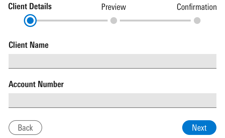
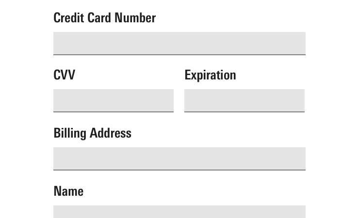
- Chunk longer forms into easily understandable steps (e.g., Step 1: Credit Card Entry. Step 2: Address Entry, etc.)
- Prepare the user before filling out a form. If there are prerequisite files needed in order to complete a process, inform the user.
- Strive to present fields in a single column layout. Multiple columns interrupt the vertical momentum of moving down the form.
- Auto-saving is preferred, when possible.
Form Behavior
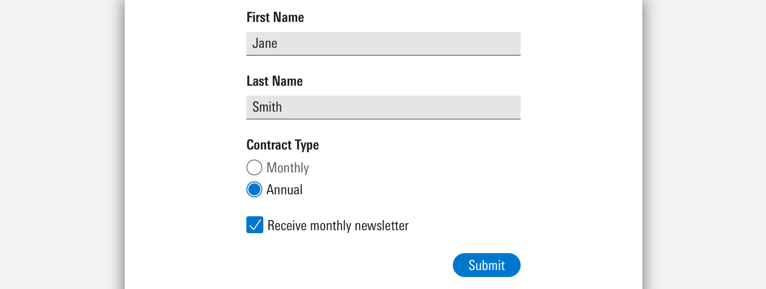
Prefilled Fields
Smart defaults help users complete forms faster.
- Pre-populate form Inputs with data a user has already provided.
- Don’t use a default for things like gender, title, occupation, or personal info we can’t assume. Also, be inclusive with the dropdown menu options you provide for a given question.
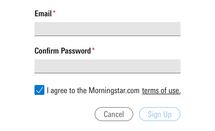
- Don’t pre-select anything that requires consent from a user or will interfere with legal compliance.
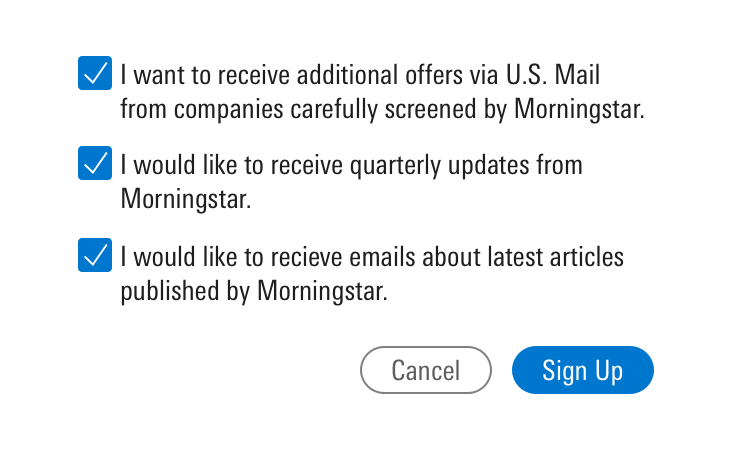
- Limit the number of offers, subscriptions, and newsletters that are pre-selected by default.
- Don’t use defaults when you want users to pay attention to entry.
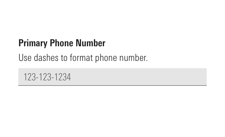
Automatic Input Formatting
When possible, use automatic input formatting for fields that require number entry. This allows the user to focus on the information that they are entering and not on how to format it. This can reduce errors and time on task. There are many open source libraries (e.g. Cleave.js) that provide the JavaScript needed.
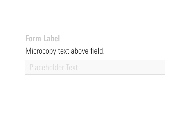
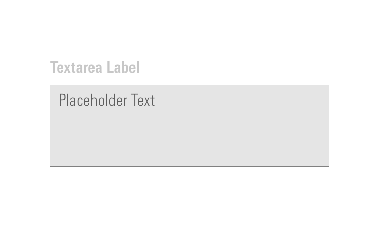
Placeholders
- Avoid using placeholder text in input fields as the only source of providing guidance because it disappears once user starts typing in the text field. Instead, use Microcopy to provide additional clarity and guidance around a given field.
- In cases where phone numbers or social security numbers need to be formatted in a certain way, use placeholder text to show format examples.
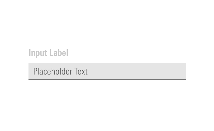
 Provide additional guidance by using placeholders.
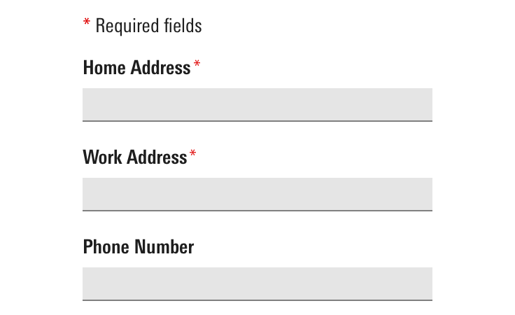
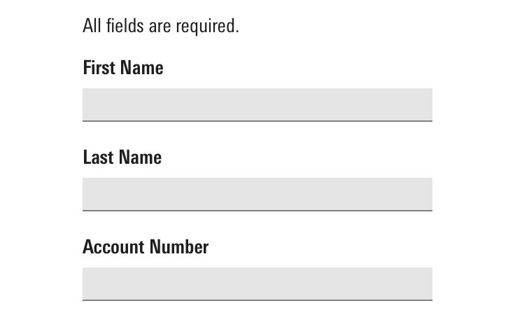
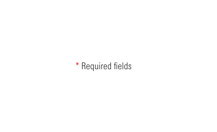
Required Vs. Optional Fields
Indicating required and optional fields within a form minimizes errors.
- To minimize visual noise, reduce the number of optional fields.
- If all fields are required, use indication at the top of the form instead of at field level.
Error Handling
When possible, use real-time inline error messaging. Data validation can notify users of any errors while filling out a form. When real-time data validation is not possible, errors are triggered upon submission of a given step.
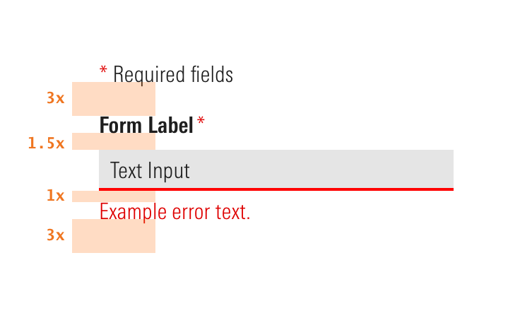
- Field Errors are below a form field.
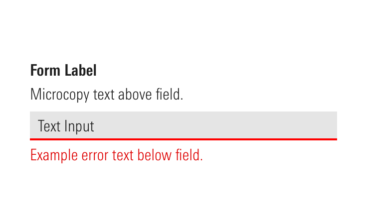 Place Field Errors below form fields.
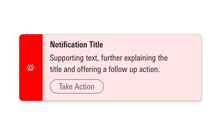
If the form is at the page level, use a combination of page Notifications and Field Errors. Notifications can give a high-level overview of one or multiple errors, then the user can go to the Field Error for more contextual details on how to resolve the issue.
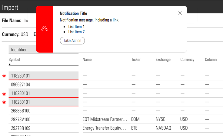 A Notification summarizing form errors on a page.
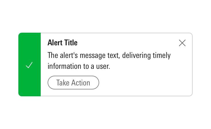
If the form is supplementary to the page, use a combination of Alerts and inline Field Errors. Alerts are component specific and give higher level information in combination with inline error for more contextual details on how to resolve the issue.
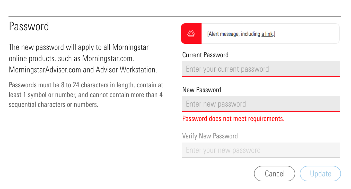 An Alert summarizing errors within a form.
See the Errors UX Pattern for more information.
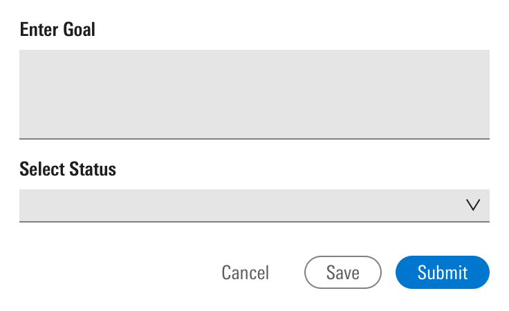
Disabling Buttons
Disabling Primary Buttons can be a strong tool for error prevention. However, it can make it harder for users to find errors if used in long forms (6 input fields or more). Therefore, only deactivate action buttons in these cases:
- Short forms. Example: Login and consent forms, etc.
- When there’s real-time inline validation
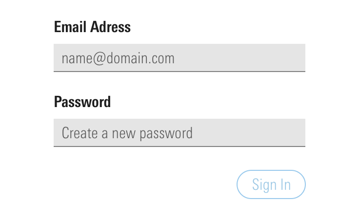 Deactivate Primary Buttons in the sign-in process.
Form Layout
Button Placement
When deciding where to place buttons on a form with a single action, follow reading direction. Place your action button at the end of the form where the eye leaves the page. In western cultures, this would be the bottom right.
When there is more than one action on a page, the placement approach could be either Directional or Task-based (non-directional).
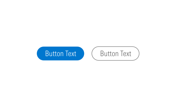
 Primary action Button should be placed at the bottom right.
Directional
In a directional approach, the main action is to navigate through a form with several steps. In most cases, these actions are intended to take the user to next or previous steps. Following reading directions, place the primary action to the bottom right, and the secondary action to bottom left.
 For directional, place the primary action to the bottom right, and the secondary action to bottom left.
Task-based or Non-directional
In a task-based or non-directional approach consider the context and decide on the priority of tasks from primary to secondary and so on. Assign a primary button to the main action, secondary style to second most important, and a flat button to the third most important action on the page. Avoid including more than three buttons on the page. Place all three buttons on the bottom right of the page in order of priority starting with the main action on the far right.
 For task-based or non-directional, place all three buttons on the bottom right of the page in order of priority starting with the main action on the far right.
Qualifiers for Buttons
Qualifiers are input fields that are not necessarily related to the form content but define conditions for the form actions. Some examples are: “Don’t ask me again.”, “I agree to terms of use”, and “Keep me signed in”. Place these qualifiers at the end of the form, close to the action buttons.
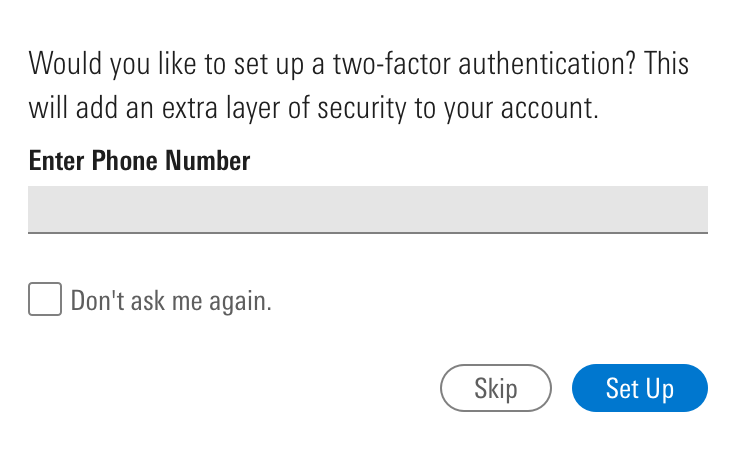 Place qualifiers at the end of the form, close to the action buttons.
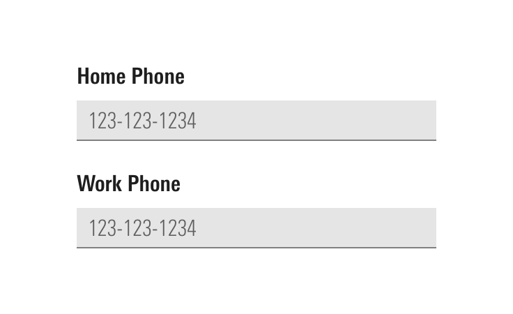
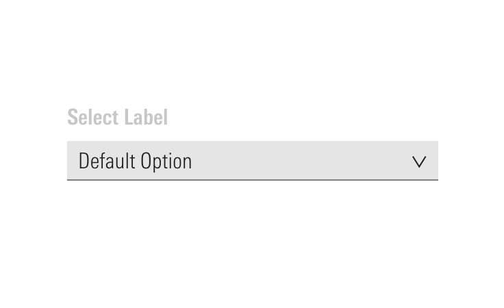
Labels
Labels are required elements to a form field. Labels are placed above the form field and left aligned with the content.
Column Layout
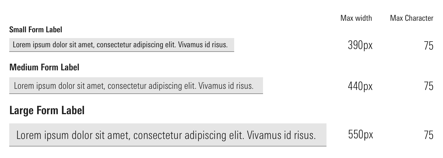
Strive to present fields in a single column layout. Multiple columns interrupt the vertical momentum of moving down the form. Rather than requiring users to visually reorient themselves, keep them in the flow by using a single column layout with a separate row for each field, and only divert when appropriate. Refer to the Typography legibility section for best column size for your form.
 Try to keep form fields in a single column.
To achieve the best width for legible form, keep the number of characters per line between 50 and 75 including spaces. Refer to Typography page for more details.
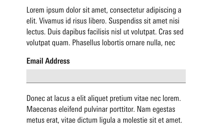
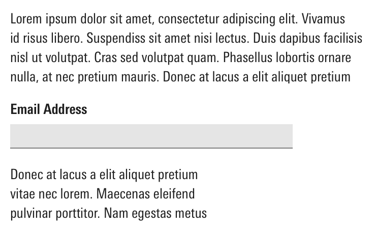
Body text within a single-column form should follow the same width.
Guidelines
Data Privacy
- Only ask for data that is absolutely necessary for a given task.
- Strive to protect your user's privacy when collecting personal information like:
- Basic identity information such as name, email, address, SSN, and ID numbers
- Web data such as location, IP address, cookies data, and RFID tag
- Health, genetic, and biometric data
- Racial or ethnic data
- Political opinions
- Gender identity
- Align your designs with the privacy policy of the country or region for which you are designing for.
- Consider adding the option to mask or unmask passwords.
Related Components
Additional Resources
- 7 Best Practices for Buttons
- Disabling Buttons if Validation is Incomplete
- Improve Your Credit Card Form UX
- Don't Put Hints Inside Text Boxes in Web Forms
- Natural Language Parsing
- Web Form Design
- Web Form Design: Filling in the Blanks by Luke Wroblewski
- The Elements of Typographic Style by Robert Bringhurst
- Primary & Secondary Action Buttons