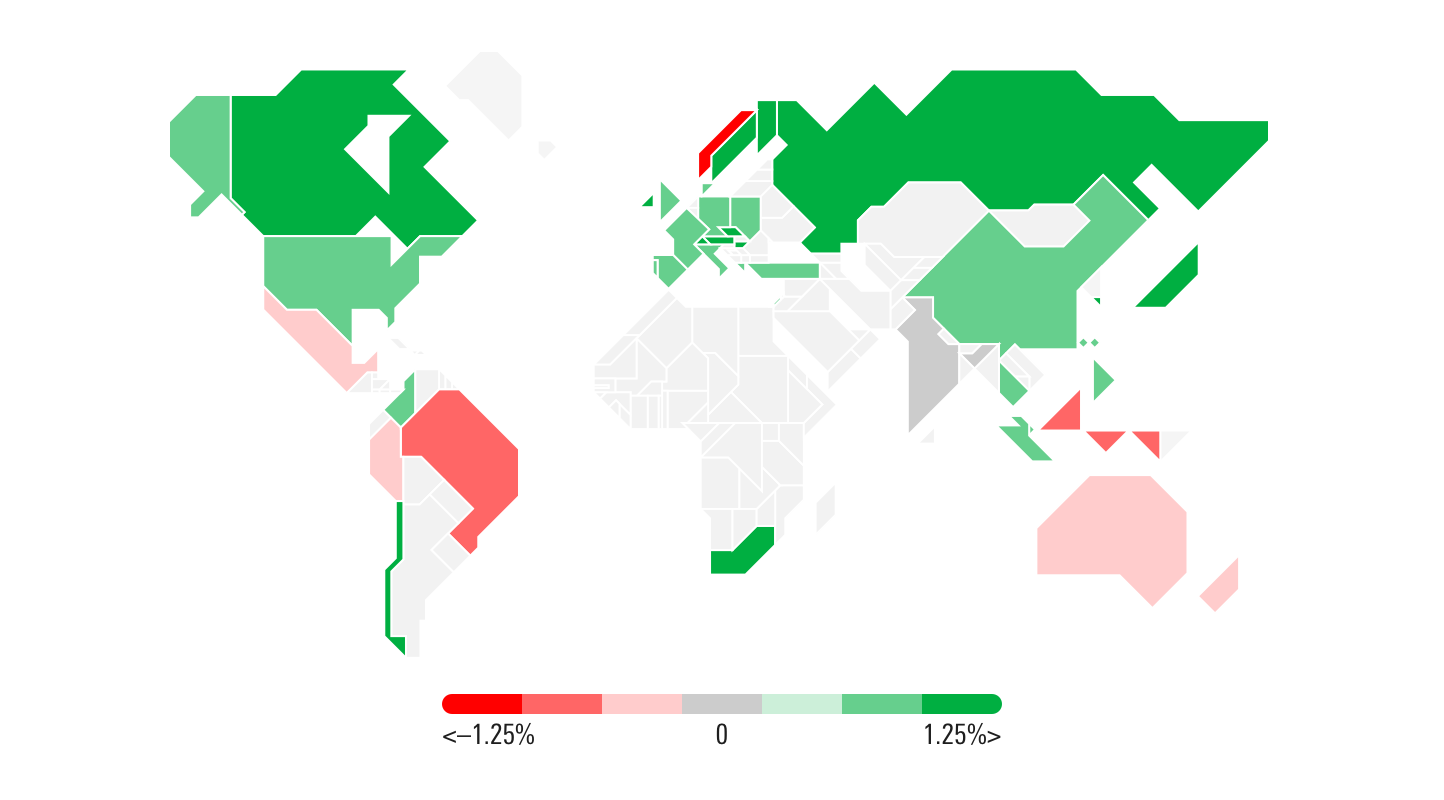
Geographical Map
Geographical Maps show the distribution of data between countries.
Geographical Map
Invalid Combination
Press Ctrl + C to copy
Guidelines
Use When
- Representing information tied to specific countries, such as global market performance.
Don′t Use When
- Displaying data where precise comparison is more important than its geographic placement. Instead, use a Horizontal Bar chart or a Vertical Bar chart.
Visual Language
- Never use colors other than those defined in the visualization palette.
- Always use the relevant color orders and meanings from the visualization palette. Common color sets to use with the Geographic Map would be Performance and Valuation.
- Always pair Geographic Maps with an appropriate label, such as a component title or section header.
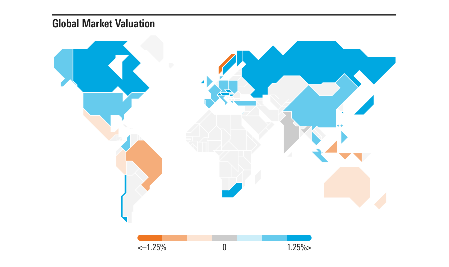
- The legend should always have seven colors, two base colors, two tints of each base color, and one neutral color. These tints can be determined by each implementing team, but they should be based off of existing color constants from the visualization palette.
 For example, when showing valuation, use
 $mds-visualization-color-performance-positive and $mds-visualization-color-performance-negative as the base colors for each color set, then tint those colors to create the two tints needed for each (i.e., 100% (base color), 60% (tint 1) and 20% (tint 2)). Use $mds-visualization-color-performance-neutral-chart to represent the central, neutral value.
Responsiveness
- Geographical Maps are fully fluid horizontally and vertically.
- The legend’s width is fixed and decreases at a component width of
320px.
Editorial
- Include the unit or increment in legend labels.
- Strive for a short, succinct label header for the chart which clearly describes the data.
Code Reference
Necessary code documentation can be found in the MBC repository.