The Morningstar Design System is a collection of brand, visual, UX, and technical standards built into a central library so that teams can quickly build high-quality, consistent experiences.
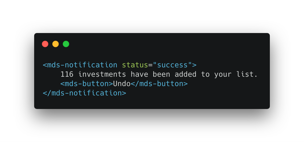
The MDS UI components you know and love, written in vanilla JavaScript, and now available for production use as custom elements with built-in support for interactions and behaviors.

New constants, new documentation, and updated UI component interactions provide the foundation for animation in the Morningstar Design System.

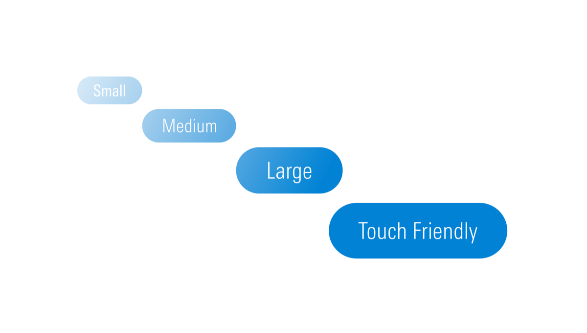
MDS now offers touch target-sized variations of many components—like Buttons, Forms, and List Groups—providing products with the parts to build accessible touch-screen experiences. See our release notes for a full list of supported components.

Here are some of the highlights of recent releases:
- Published principles and guidelines for adding animation to product experiences, as well as the constants used to ensure animations are implemented in a consistent manner.
- Published documentation for a new
Touchsize variation, which can be used to ensure common UI components are large enough to be usable on touch displays regardless of screen size. - Published documentation for a new variation of the Combo Box component that allows the user to select multiple options. Thanks to Aji Vishwambharan for contributing this component.
- Added to our list of CodePen examples, with collections focused on Animation and MDS Web Components. You can navigate to our Team Dashboard for access to our full collection of shared Pens.
In addition to ongoing support for adopting teams and continuing to extend and support existing capabilities, the MDS team is actively working on:
- Extending our growing library of MDS UI Components with a new Search Results Web Component, as well as a redesigned, Web Component version of our existing Data Tables component. Check out the component status page for a list of available components.
- Improving the usability of our iconography, and aligning on a single set of icons to be used by all products.
- Modularizing our library by component, giving us more flexibility to quickly respond to customer and market needs.
- Supporting and enhancing MDS Web Components, while simultaneously helping product teams improve the overall depth and resilience of their MDS implementation.

The Morningstar Design System is powered and improved by the teams that use it. We’d love to hear your feedback.

