Accordions
- HTML/CSS Available
- Web Component Unavailable
- Last Updated
2.7.0
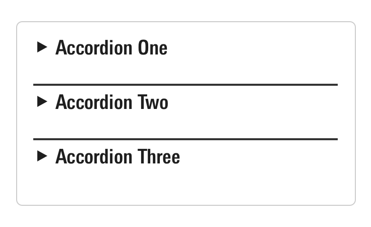
Accordions expand and collapse content below a Header to control the display of a cohesive set of information and functionality.
Accordion
Anatomy
Accordions are constructed using the Headers component, see the Headers page for all available variations. Use the content container to hold any other components or product markup.

|
Name
|
Required
|
Description
|
|---|---|---|
|
Header |
Yes |
Offers a title summarizing the content and affords functionality via optional actions. See Headers for all available variations. |
|
Arrow |
Yes |
Acts as an affordance to indicate the functionality of the accordion, as well as a visual marker of the state of the accordion through its rotation and direction. |
|
Content |
Yes |
Holds other components or product markup and is visually shown and hidden by interacting with the header. |
Variations
Default
Use to provide expand and collapse functionality for a section of content.
[Your content here.]
[Your content here.]
<div class="mds-accordion">
    <input id="label-header--66356" type="checkbox" role="button" aria-controls="mds-accordion-example--66356" class="mds-accordion__trigger" />
    <label for="label-header--66356" class="mds-accordion__label">
        <div class="mds-header mds-header--primary mds-header--level-5">
            <h2 class="mds-header__title">
                Accordion Title
                <div class="mds-header__title-description">
                    <button class="mds-button mds-button--icon-only" type="button">
                        <svg class="mds-icon mds-button__icon mds-button__icon--left" aria-hidden="true">
                            <use xlink:href="#question-circle">
                            </use>
                        </svg>
                    </button>
                </div>
            </h2>
            <div class="mds-header__actions">
                <button class="mds-button mds-button--secondary" type="button">
                    Action
                </button>
            </div>
        </div>
    </label>
    <section class="mds-accordion__content" id="mds-accordion-example--66356">
        <p>[Your content here.]</p>
    </section>
</div>- Refer to Headers documentation for available variations and guidelines.
- Apply Header modifier classes to control the border style and heading level of the contained Header.
Without Border
Use when omitting the contained Header’s border.
[Your content here.]
[Your content here.]
<div class="mds-accordion">
    <input id="label-header--6321" type="checkbox" role="button" aria-controls="mds-accordion-example--6321" class="mds-accordion__trigger" />
    <label for="label-header--6321" class="mds-accordion__label">
        <div class="mds-header mds-header--level-5">
            <h2 class="mds-header__title">
                Accordion Title
                <div class="mds-header__title-description">
                    <button class="mds-button mds-button--icon-only" type="button">
                        <svg class="mds-icon mds-button__icon mds-button__icon--left" aria-hidden="true">
                            <use xlink:href="#question-circle">
                            </use>
                        </svg>
                    </button>
                </div>
            </h2>
            <div class="mds-header__actions">
                <button class="mds-button mds-button--secondary" type="button">
                    Action
                </button>
            </div>
        </div>
    </label>
    <section class="mds-accordion__content" id="mds-accordion-example--6321">
        <p>[Your content here.]</p>
    </section>
</div>- Always omit Header border modifier classes from the contained header within this variation.
Bottom Border
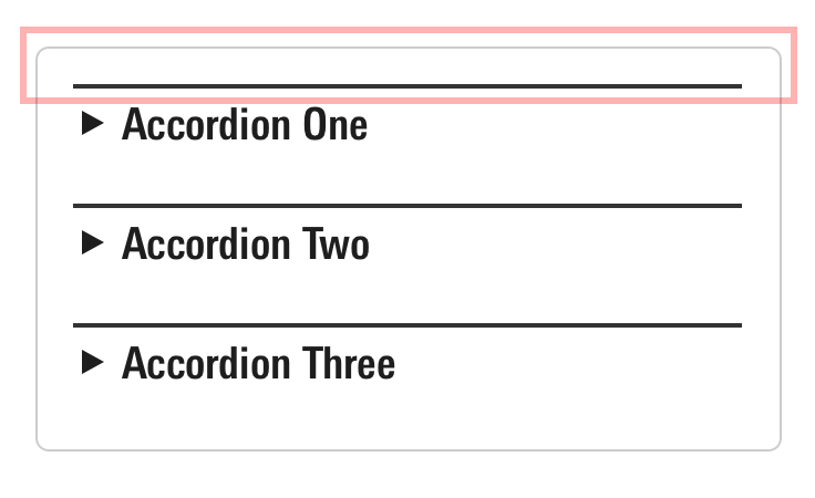
Use when placing an accordion within a Module Container.
[Your content here.]
[Your content here.]
<div class="mds-accordion doc-accordion-bottom-border">
    <input id="label-header--98423" type="checkbox" role="button" aria-controls="mds-accordion-example--98423" class="mds-accordion__trigger" />
    <label for="label-header--98423" class="mds-accordion__label">
        <div class="mds-header mds-header--primary mds-header--level-5 mds-header--border-bottom">
            <h2 class="mds-header__title">
                Accordion Title
                <div class="mds-header__title-description">
                    <button class="mds-button mds-button--icon-only" type="button">
                        <svg class="mds-icon mds-button__icon mds-button__icon--left" aria-hidden="true">
                            <use xlink:href="#question-circle">
                            </use>
                        </svg>
                    </button>
                </div>
            </h2>
            <div class="mds-header__actions">
                <button class="mds-button mds-button--secondary" type="button">
                    Action
                </button>
            </div>
        </div>
    </label>
    <section class="mds-accordion__content" id="mds-accordion-example--98423">
        <p>[Your content here.]</p>
    </section>
</div>- Always include the
mds-header--border-bottommodifier class on the Header within this variation.
Sizing
Follow the Headers sizing guidelines. An accordion’s arrow element will resize automatically to visually match the mds-header--level-[1–9] modifier class applied to the contained Header.
Examples
Accordion Within Module Container
This example shows an accordion placed within a Module Container and includes attributes establishing an accessible relationship between the two components.
MDS Features
- Accordion uses the bottom border variation, hiding the contained Header’s bottom border when collapsed.
- Header within the accordion uses the
mds-header--border-bottommodifier class to restyle the header's border and internal padding for placement within a container.
Customizations
To meet accessibility requirements, some additional attributes must be added to the markup to establish a relationship between the Header and Module Container.
- Add a unique
idto themds-header__titleelement. - Reference the
idin anaria-labelledbyattribute on themds-module-containerelement.
The Morningstar Design System aligns product teams on Morningstar brand, visual language, UX, and technical standards.
<div class="mds-module-container" aria-labelledby="header-id-1">
    <div class="mds-accordion">
        <input id="label-header--93344" type="checkbox" role="button" aria-controls="mds-accordion-example--0003" class="mds-accordion__trigger" />
        <label for="label-header--93344" class="mds-accordion__label">
            <div class="mds-header mds-header--primary mds-header--level-5 mds-header--border-bottom">
                <h2 class="mds-header__title" id="header-id-1"> Accordion Title 1 </h2>
                <div class="mds-header__actions">
                    <button class="mds-button mds-button--secondary" type="button"> Action </button>
                </div>
            </div>
        </label>
        <section class="mds-accordion__content" id="mds-accordion-example--0003">
            <div class="accordion-sample-paragraph">
                <p>The Morningstar Design System aligns product teams on Morningstar brand, visual language, UX, and technical standards.</p>
            </div>
        </section>
    </div>
</div>
Stack of Accordions
This example shows a stack of accordions with stack space constants used to apply margin-bottom to each.
MDS Features
- Uses the without border variation for the first accordion in the stack.
Customizations
To space out accordions vertically, apply stack space constants within your product’s code. For instance, this example:
- Wraps all accordions in a
<div>using thedemo-accordion--stackclass. - Applies the following styles to that class within your product’s SCSS:
.demo-accordion--stack {
    .mds-accordion {
        margin: $mds-space-stack-2-x;

        &:last-child {
            margin: 0;
        }
    }
}The Morningstar Design System aligns product teams on Morningstar brand, visual language, UX, and technical standards.
The Morningstar Design System aligns product teams on Morningstar brand, visual language, UX, and technical standards.
The Morningstar Design System aligns product teams on Morningstar brand, visual language, UX, and technical standards.
<div class="demo-accordion--stack">
    <div class="mds-accordion">
        <input id="label-header--53108" type="checkbox" role="button" aria-controls="mds-accordion-example--53108" class="mds-accordion__trigger" />
        <label for="label-header--53108" class="mds-accordion__label">
            <div class="mds-header mds-header--primary mds-header--level-5">
                <h2 class="mds-header__title">
                    Accordion Title 1
                </h2>
                <div class="mds-header__actions">
                    <button class="mds-button mds-button--secondary" type="button">
                        Action
                    </button>
                </div>
            </div>
        </label>
        <section class="mds-accordion__content" id="mds-accordion-example--53108">
            <div class="accordion-sample-paragraph">
                <p>The Morningstar Design System aligns product teams on Morningstar brand, visual language, UX, and technical standards.</p>
            </div>
        </section>
    </div>
    <div class="mds-accordion">
        <input id="label-header--78512" type="checkbox" role="button" aria-controls="mds-accordion-example--78512" class="mds-accordion__trigger" />
        <label for="label-header--78512" class="mds-accordion__label">
            <div class="mds-header mds-header--primary mds-header--level-5">
                <h2 class="mds-header__title">
                    Accordion Title 2
                </h2>
                <div class="mds-header__actions">
                    <button class="mds-button mds-button--secondary" type="button">
                        Action
                    </button>
                </div>
            </div>
        </label>
        <section class="mds-accordion__content" id="mds-accordion-example--78512">
            <div class="accordion-sample-paragraph">
                <p>The Morningstar Design System aligns product teams on Morningstar brand, visual language, UX, and technical standards.</p>
            </div>
        </section>
    </div>
    <div class="mds-accordion">
        <input id="label-header--46594" type="checkbox" role="button" aria-controls="mds-accordion-example--46594" class="mds-accordion__trigger" />
        <label for="label-header--46594" class="mds-accordion__label">
            <div class="mds-header mds-header--primary mds-header--level-5">
                <h2 class="mds-header__title">
                    Accordion Title 3
                </h2>
                <div class="mds-header__actions">
                    <button class="mds-button mds-button--secondary" type="button">
                        Action
                    </button>
                </div>
            </div>
        </label>
        <section class="mds-accordion__content" id="mds-accordion-example--46594">
            <div class="accordion-sample-paragraph">
                <p>The Morningstar Design System aligns product teams on Morningstar brand, visual language, UX, and technical standards.</p>
            </div>
        </section>
    </div>
</div>
Guideliness
Use When
- Combining a set of content with expand and collapse functionality.
- Allowing a user to hide controls and content so they can better focus on their task.
Don't Use When
- Providing an introductory element to a set of content which doesn’t need expand and collapse functionality. Instead, use a Header.
- Creating a set of visibly contained content which doesn’t need expand and collapse functionality. Instead, use a Module Container.
Visual Language
- The arrow icon acts as an affordance to indicate the functionality of the accordion, as well as a visual marker of the state of the accordion through its rotation and direction.
- When stacking multiple accordions, use stack space constants to add
margin-bottomto the block element.


Behaviors
- When an accordion expands and collapses only its height should change, its width should stay consistent.
- Expand and collapse functionality should never be triggered on hover.
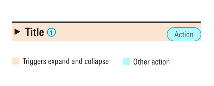
- The expand and collapse functionality of an accordion is tied to the entire header of the component, with additional actions being triggered only by interaction within the bounds of their related UI components.
 Interactive areas within an accordion.
Editorial
- Keep titles to five words, if possible, to avoid wrapping.
- Use title case and capitalize prepositions of four letters or more.
Accessibility
- Follow the Header accessibility guidelines.
- Always give the
mds-accordion__contentelement a uniqueidand set it as themds-accordion__triggerelement’saria-controlsattribute. For example:
<input id="label-header--7410" type="checkbox" role="button" aria-controls="mds-accordion-example--0001" class="mds-accordion__trigger">
...
<section class="mds-accordion__content" id="mds-accordion-example--0001">
...- Include the
aria-expandedattribute on themds-accordion__triggerelement and write custom JavaScript to toggle its boolean value based on whether the accordion is expanded or collapsed. For example:
<!-- Collapsed State -->
<input id="label-header--7410" type="checkbox" role="button" aria-expanded="false" aria-controls="mds-accordion-example--0002" class="mds-accordion__trigger">...
<!-- Expanded State -->
<input id="label-header--7410" type="checkbox" role="button" aria-expanded="true" aria-controls="mds-accordion-example--0002" class="mds-accordion__trigger">...
