Empty State
Empty State
- HTML/CSS Unavailable
- Web Component Available
- Last Updated
2.29.0
Empty states appear when content is missing or unavailable, providing insight on what has happened and how to proceed.
Anatomy
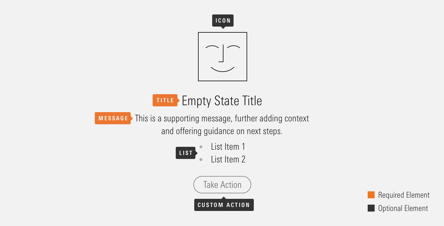
Empty states can be configured in a variety of ways depending on the situation and context. Implementing teams are encouraged to use the particular set of elements which best serve their use case.

|
Name
|
Required
|
Description
|
|---|---|---|
|
Title |
Yes |
Briefly summarizes what went wrong (or right). |
|
Message |
Yes |
Provides additional context and offers guidance on next steps. |
|
Icon |
No |
Supplements the empty state message. |
|
List |
No |
Lists out criteria or additional options. |
|
Custom Action |
No |
Displays Buttons that allow a user to take an action as a result of the empty state. |
Variations
Default
<mds-empty-state title="You Haven’t Created Any Reports Yet" message="Reports can be generated from Clients & Accounts, Billing, or Batch Schedules."></mds-empty-state>With Action
Include a Button to provide users with a follow up action to resolve an empty state.
<mds-empty-state title="You Don’t Have Any Alerts Yet" message="You’ll find the history of your alerts here once a change occurs. If you haven’t set up alerts, add them now.">
    <mds-button slot="mds-empty-state-actions" size="medium" variation="primary">Add Alerts</mds-button>
</mds-empty-state>
With Icon
Use an icon to add meaning or to create a moment of delight.

<mds-empty-state title="Your Data Looks Great" message="We found no issues today.">
    <img slot="mds-empty-state-icon" src="/images/components/empty-state/check-circle.svg" role="presentation">
</mds-empty-state>- Use of icons should be reserved to situations where the tone of the message is positive, such as onboarding a new customer, rather than noting that a data service has failed to load.
- Use illustrative icons to create imagery for an empty state.
With List
Use a list to add structure to the empty state’s content, for example, specific criteria for a search query.
<mds-empty-state title="No Results" message="Try adjusting your search query." list='["Try removing filters.", "Try different keywords."]' size="medium">
</mds-empty-state>
Sizing
Sizing affects text size and internal padding. The default size is medium and you can use props to make the empty state smaller or larger.


<mds-empty-state size="small" title="Empty State Title" message="This is a supporting message, further adding context and offering guidance on next steps." list='["List item 1", "List item 2"]'>
    <img slot="mds-empty-state-icon" src="/images/components/empty-state/happy-face-70.svg" role="presentation">
    <mds-button slot="mds-empty-state-actions" size="small" variation="secondary">Take Action</mds-button>
</mds-empty-state>- When including an action, use the corresponding size variation. For example, a large empty state should use a large Button.
Use When
- Content is missing from a page and you need to communicate why.
- A user is starting a new workflow and hasn’t created any content yet.
- A user has nothing more to do. For example, when they have completed all tasks, read all messages, or seen all notifications.
Visual Language
Positioning
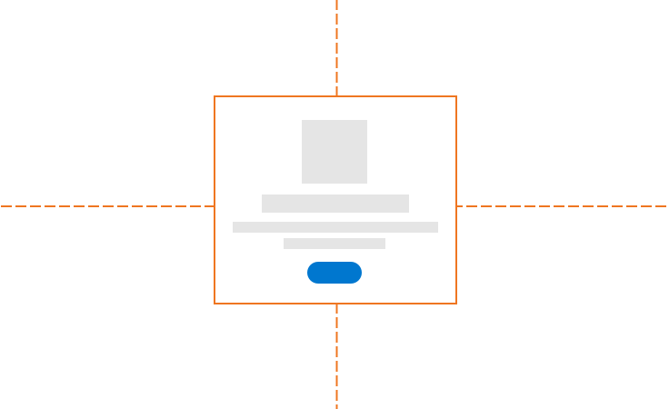
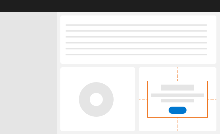
Center empty states horizontally and vertically within their container.


Actions
- When including an action, use the corresponding size variation. For example, a large empty state should use a large Button.
- See the Buttons documentation for guidance on button usage.
Icons
- Use of icons should be reserved to situations where the tone of the message is positive, such as onboarding a new customer, rather than noting that a data service has failed to load.
- Use illustrative icons when creating imagery for an empty state.
Saving Icon Artwork
- Icons should use transparent backgrounds.
- Icons should be either an SVG or PNG.
- Icon size varies depending on empty state size:
- Small:
70x70px - Medium:
85x85px - Large:
100x100px
- Small:
Behaviors
- Empty states include a maximum width to ensure optimal typographic line lengths and will scale down fluidly on smaller viewports.
Editorial
- Use the empty state’s title to inform a user what is happening and the message to provide additional details and potential next steps.
- Use the message-design framework to craft content for your empty state.
- Use title case for the empty state title.
- Use complete sentences for the empty state message.
- Be judicious when using list items. If you find yourself including more than three items, consider adjusting your empty state’s message content to include more of the details covered in the unordered list.
Web Component
Props
When setting props as attributes on a custom HTML element, use kebab-case instead of camelCase.
|
Prop
|
Type
|
Validation
|
Default
|
Description
|
|---|---|---|---|---|
|
|
String |
— |
— |
A space-separated list of class names that will be appended to the default |
|
|
Array |
— |
— |
Sets list content of the empty state. |
|
|
String |
Required |
— |
Sets the message text for the empty state. |
|
|
String |
One of: |
|
Alters the size of the empty state. |
|
|
String |
Required |
— |
Sets the title text for the empty state. |
Slots
Default Slot
Pass text in between the <mds-empty-state></mds-empty-state> tags to set the title content. This can be overridden with the title prop.
Named Slots
|
Slot Name
|
Description
|
|---|---|
|
|
Displays an icon image within the empty state. |
|
|
Displays Buttons. |
Usage Examples
Setting message and size via props. Using the default slot for title content and named slots for an icon and action button:
<mds-empty-state size="large" message="This is an example message.">
    Example Title Text
    <img slot="mds-empty-state-icon" src="path/to/image.svg">
    <mds-button slot="mds-emptty-state-actions" size="large">Take Action</mds-button>
</mds-empty-state>Implementation
- Reference the accessibility guidelines for Buttons when including an action in the empty state.
- Add
role="presentation"to purely decorational empty state icons to ensure they are ignored by screen readers.
Best Practices
- Never rely on an empty state’s icon alone to communicate meaning. Craft your empty state’s text content to provide a user with everything they need to know, even if they are unable to see the page.

