Tooltips
- HTML/CSS Available
- Web Component Available
- Last Updated
2.28.0
Tooltips provide a short description of a page element or control.
Variations
Default
Use to provide a short description of an object without a label.
<div class="mds-tooltip__wrapper">
    <button class="mds-button mds-button--secondary" type="button" aria-describedby="tooltip1">
        Hover for Tooltip
    </button>
    <div id="tooltip1" class="mds-tooltip mds-tooltip--default mds-tooltip--width-m mds-tooltip--right-center" role="tooltip" aria-hidden="false" aria-labelledby="tooltiptext1">
        <div class="mds-tooltip__text " id="tooltiptext1">
            Tooltip Text
        </div>
    </div>
</div>
<mds-button variation="secondary" id="default-trigger" type="button"> Hover for Tooltip </mds-button>
<!-- Tooltip must be appended at the end of the <body> -->
<mds-tooltip triggered-by="default-trigger" id="default-tooltip" position="right-center"> Tooltip Text </mds-tooltip>- Triggered by hovering over an object.
Prompt
Use to temporarily direct attention to an object or functionality.
<div class="mds-tooltip__wrapper">
    <button class="mds-button mds-button--icon-only mds-tooltip__target mds-tooltip__target--block" type="button" aria-describedby="tooltip2">
        <svg class="mds-icon mds-button__icon mds-button__icon--right">
            <use xlink:href="#plus">
                <title>Add to list</title>
            </use>
        </svg>
    </button>
    <div id="tooltip2" class="mds-tooltip mds-tooltip--prompt mds-tooltip--width-l mds-tooltip--sticky mds-tooltip--closable mds-tooltip--right-center" role="tooltip" aria-hidden="false" aria-labelledby="tooltiptext2">
        <div class="mds-tooltip__text " id="tooltiptext2">
            Your list is empty. Add some investments to get started.
        </div>
        <div class=" mds-tooltip__close-button">
            <button class="mds-button mds-button--small mds-button--icon-only">
                <svg class="mds-icon mds-button__icon">
                    <use xlink:href="#remove--s">
                        <title>Close</title>
                    </use>
                </svg>
            </button>
        </div>
    </div>
</div>
<mds-button variation="icon-only" icon="plus" id="prompt-trigger" type="button"> Add to List </mds-button>
<!-- Tooltip must be appended to end of <body> -->
<mds-tooltip variation="prompt" triggered-by="prompt-trigger" id="prompt-tooltip" position="right-center"> Your list is empty. Add some investments to get started. </mds-tooltip>- Dismissable by clicking the close button.
Error
Use to direct attention to an error.
<div class="mds-tooltip__wrapper">
    <button class="mds-button mds-button--primary" type="button" disabled aria-describedby="tooltip3">
        Submit
    </button>
    <div id="tooltip3" class="mds-tooltip mds-tooltip--error mds-tooltip--width-l mds-tooltip--sticky mds-tooltip--right-center" role="tooltip" aria-hidden="false" aria-labelledby="tooltiptext3">
        <div class="mds-tooltip__text " id="tooltiptext3">
            You can’t move forward because there’s a problem. Correct all errors and submit again.
        </div>
    </div>
</div>
<mds-button variation="primary" id="error-trigger" type="button" disabled> Submit </mds-button>
<!-- Tooltip must be appended at the end of the <body> -->
<mds-tooltip variation="error" triggered-by="error-trigger" id="error-tooltip" position="right-center" visible>
You can’t move forward because there’s a problem. Correct all errors and submit again.
</mds-tooltip>- Dismissable by correcting error.
- Not commonly used. For inline errors, please see Field Errors.
Tooltip Positioning
There are 12 possible positions. Choose one that keeps the tooltip’s content in the viewport. For all positioning options see class references or props.
<div class="mds-tooltip__wrapper">
    <button class="mds-button " type="button" aria-describedby="tooltip4">
        Top Center
    </button>
    <div id="tooltip4" class="mds-tooltip mds-tooltip--default mds-tooltip--width-m mds-tooltip--top-center" role="tooltip" aria-hidden="true" aria-labelledby="tooltiptext4">
        <div class="mds-tooltip__text " id="tooltiptext4">
            Top Center
        </div>
    </div>
</div>
<div class="mds-tooltip__wrapper">
    <button class="mds-button " type="button" aria-describedby="tooltip5">
        Right Bottom
    </button>
    <div id="tooltip5" class="mds-tooltip mds-tooltip--default mds-tooltip--width-m mds-tooltip--right-bottom" role="tooltip" aria-hidden="true" aria-labelledby="tooltiptext4">
        <div class="mds-tooltip__text " id="tooltiptext4">
            Right Bottom
        </div>
    </div>
</div>
<mds-button variation="secondary" id="top-center-trigger" type="button"> Top Center </mds-button>
<mds-button variation="secondary" id="right-bottom-trigger" type="button"> Right Bottom </mds-button>
<!-- Tooltip must be appended at the end of the <body> -->
<mds-tooltip triggered-by="top-center-trigger" id="top-center-tooltip" position="top-center">
Top Center
</mds-tooltip>
<mds-tooltip triggered-by="right-bottom-trigger" id="right-bottom-tooltip" position="right-bottom">
Right Bottom
</mds-tooltip>The web component includes built-in edge detection logic that always keeps the tooltip within the viewport. To use this logic, omit the position prop from the custom element.
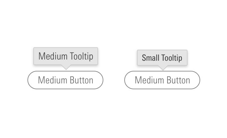
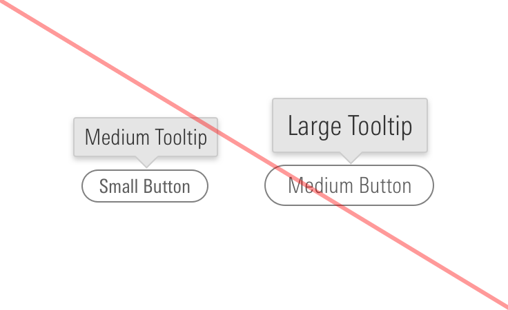
Sizing
Sizing affects the text size and internal spacing. The default size is medium, and you can use modifier classes or props to make the tooltip smaller or larger.
<div class="mds-tooltip__wrapper">
    <button class="mds-button mds-button--secondary" type="button" aria-describedby="small-tooltip">
        Hover for Tooltip
    </button>
    <div id="small-tooltip" class="mds-tooltip mds-tooltip--default mds-tooltip--small mds-tooltip--width-m mds-tooltip--right-center" role="tooltip" aria-hidden="false" aria-labelledby="false">
        <div class="mds-tooltip__text " id="false">
            Tooltip Text
        </div>
    </div>
</div>
<mds-button variation="secondary" id="small-trigger" type="button"> Hover for Tooltip </mds-button>
<!-- Tooltip must be appended at the end of the <body> -->
<mds-tooltip size="small" triggered-by="default-trigger" id="default-tooltip" position="right-center"> Tooltip Text </mds-tooltip>Use When
- Providing a short description of a page element or control.
- Describing the action of an icon-only button.
- Revealing the full text of truncated data.
- Revealing the purpose of a menu that has a dynamic title.
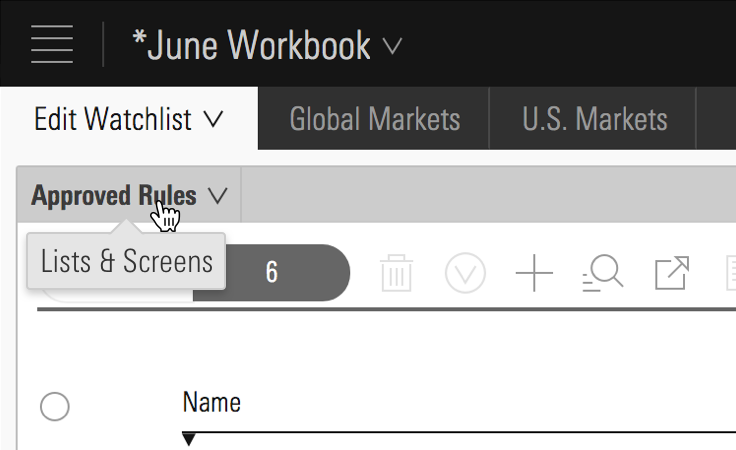 Lists & Screens menu inside Direct Cloud.
Don’t Use When
- Providing a description longer than 10 words. Instead, use a Popover.
Visual Language
- Consider applying a custom
z-indexvalue when you compose this component with other layered components, e.g., Dialogs, Modals, Popovers or Notifications to meet your product requirements.
Editorial
- Keep it brief—aim for fewer than 10 words.
- End full sentences with a period. Using “&” is OK. No “!”.
- For brevity, don’t spell out numbers: Use 12, not twelve.
Related UX Patterns
CSS
Class References
|
Class
|
Applies to
|
Outcome
|
|---|---|---|
|
|
Any block, or inline-block element, most likely a |
This class should be on the immediate parent of the tooltip’s target element, and it must wrap the target and the tooltip itself. If the tooltip is triggered on hover, this is the element on which that hover is triggered. |
|
|
Any inline, block, or inline-block element |
This is used to enable showing/hiding the tooltip on keyboard focus of a focusable tooltip target element. For example, if the tooltip target is an |
|
|
|
Sets background color, drop shadow and text styling for a default tooltip. |
|
|
|
Adjusts styling to render a small tooltip. |
|
|
|
Adjusts styling to render a large tooltip. |
|
|
|
Sets background color, drop shadow and text styling for a prompt tooltip. |
|
|
|
Sets background color, drop shadow and text styling for an error tooltip. |
|
|
|
Gives a tooltip padding space to account for a close button. |
|
|
Any block, inline-block, or inline element |
Changes cursor to (?) symbol on hover indicating help information. |
|
|
|
Aligns tooltip to the top center of the invoking element. |
|
|
|
Aligns tooltip to the top right of the invoking element. |
|
|
|
Aligns tooltip to the top left of the invoking element. |
|
|
|
Aligns tooltip to the bottom center of the invoking element. |
|
|
|
Aligns tooltip to the bottom right of the invoking element. |
|
|
|
Aligns tooltip to the bottom left of the invoking element. |
|
|
|
Aligns tooltip to the right center of the invoking element. |
|
|
|
Aligns tooltip to the right top of the invoking element. |
|
|
|
Aligns tooltip to the right bottom of the invoking element. |
|
|
|
Aligns tooltip to the left center of the invoking element. |
|
|
|
Aligns tooltip to the left top of the invoking element. |
|
|
|
Aligns tooltip to the left bottom of the invoking element. |
Web Component
Props
When setting props as attributes on a custom HTML element, use kebab-case instead of camelCase.
|
Prop
|
Type
|
Validation
|
Default
|
Description
|
|---|---|---|---|---|
|
|
String |
— |
— |
A space-separated list of class names that will be appended to the default |
|
|
String |
— |
|
Sets the |
|
|
String |
One of: |
|
Sets position of the tooltip relative to its trigger. |
|
|
String |
One of: |
|
Alters size of the tooltip. |
|
|
String |
Required |
— |
Sets the tooltip text. Can also be passed via the default slot. |
|
|
String |
Required |
— |
The |
|
|
String |
One of: |
|
Sets the tooltip variation. |
|
|
Boolean |
— |
|
Sets visibility of the tooltip. |
Slots
Default Slot
Any text passed in between the <mds-tooltip></mds-tooltip> tags will be used as the tooltip’s text content.
Methods
|
Method Name
|
Description
|
|---|---|
|
|
Shows tooltip. Called on |
|
|
Hides tooltip. Called on |
Events
|
Event Name
|
Description
|
|---|---|
|
|
Triggers when the tooltip is dismissed. |
Usage Examples
Setting triggeredBy and size via props. Using the default slot for text content:
<mds-button id="tip-1" type="button"> Tooltip </mds-button>
<!-- Appended at end of <body> -->
<mds-tooltip triggered-by="tip-1" size="small"> Tooltip text </mds-tooltip>
Setting triggeredBy and variation via props. Using the default slot for text content:
<mds-button id="tip-2" type="button"> Tooltip </mds-button>
<!-- Appended at end of <body> -->
<mds-tooltip triggered-by="tip-2" variation="prompt" visible> Prompt tooltip text </mds-tooltip>Implementation
- A tooltip’s trigger should be focusable, the tooltip should show on focus and hide on blur.
- Use
aria-hidden="true"to prevent screenreaders from reading hidden tooltips. Change value tofalsewhen tooltip is visible. - Tooltip trigger element should have a
aria-describedbyattribute which references to theidof the associated tooltip.
Best Practices
- By default, tooltips use
role="tooltip".