Switches
- HTML/CSS Available
- Web Component Available
- Last Updated
2.23.0
Switches afford a choice between one of two opposing states or options.
Variations
Default
<!-- Off -->
<div class="mds-switch">
    <label class="mds-switch__label" for="switch--61529">
        <input id="switch--61529" type="checkbox" role="switch" class="mds-switch__input">
        <span class="mds-switch__text">
            Logic Mode
        </span>
    </label>
</div>
<!-- Off, Disabled -->
<div class="mds-switch">
    <label class="mds-switch__label" for="switch--15973">
        <input id="switch--15973" type="checkbox" role="switch" class="mds-switch__input" disabled>
        <span class="mds-switch__text">
            Logic Mode
        </span>
    </label>
</div>
<!-- On -->
<div class="mds-switch">
    <label class="mds-switch__label" for="switch--37117">
        <input id="switch--37117" type="checkbox" role="switch" class="mds-switch__input" checked>
        <span class="mds-switch__text">
            Logic Mode
        </span>
    </label>
</div>
<!-- On, Disabled -->
<div class="mds-switch">
    <label class="mds-switch__label" for="switch--62437">
        <input id="switch--62437" type="checkbox" role="switch" class="mds-switch__input" disabled checked>
        <span class="mds-switch__text">
            Logic Mode
        </span>
    </label>
</div>
<!-- Off -->
<mds-switch name="default"> Logic Mode </mds-switch>
<!-- Off, Disabled -->
<mds-switch disabled name="default"> Logic Mode </mds-switch>
<!-- On -->
<mds-switch name="default" checked> Logic Mode </mds-switch>
<!-- On, Disabled -->
<mds-switch disabled checked name="default"> Logic Mode </mds-switch>Without Label
Use when the purpose of a switch is clearly implied by its proximity to other content and controls.
<!-- Off -->
<div class="mds-switch mds-switch--hide-label">
    <label class="mds-switch__label" for="switch--31677">
        <input id="switch--31677" type="checkbox" role="switch" class="mds-switch__input">
        <span class="mds-switch__text">
            Logic Mode
        </span>
    </label>
</div>
<!-- Off, Disabled -->
<div class="mds-switch mds-switch--hide-label">
    <label class="mds-switch__label" for="switch--67291">
        <input id="switch--67291" type="checkbox" role="switch" class="mds-switch__input" disabled>
        <span class="mds-switch__text">
            Logic Mode
        </span>
    </label>
</div>
<!-- On -->
<div class="mds-switch mds-switch--hide-label">
    <label class="mds-switch__label" for="switch--80202">
        <input id="switch--80202" type="checkbox" role="switch" class="mds-switch__input" checked>
        <span class="mds-switch__text">
            Logic Mode
        </span>
    </label>
</div>
<!-- On, Disabled -->
<div class="mds-switch mds-switch--hide-label">
    <label class="mds-switch__label" for="switch--25955">
        <input id="switch--25955" type="checkbox" role="switch" class="mds-switch__input" disabled checked>
        <span class="mds-switch__text">
            Logic Mode
        </span>
    </label>
</div>
<!-- Off -->
<mds-switch hidden-text name="without-label"> Logic Mode </mds-switch>
<!-- Off, Disabled -->
<mds-switch hidden-text disabled name="without-label"> Logic Mode </mds-switch>
<!-- On -->
<mds-switch hidden-text name="without-label" checked> Logic Mode </mds-switch>
<!-- On, Disabled -->
<mds-switch hidden-text disabled checked name="without-label"> Logic Mode </mds-switch>Switch Group
<fieldset class="mds-switch__group" role="group">
    <legend class="mds-switch__group-label">
        Client Configuration Options
    </legend>
    <div class="mds-switch">
        <label class="mds-switch__label" for="switch--29399">
            <input id="switch--29399" type="checkbox" role="switch" class="mds-switch__input">
            <span class="mds-switch__text">
                Display Overview/Investment
            </span>
        </label>
    </div>
    <div class="mds-switch">
        <label class="mds-switch__label" for="switch--10125">
            <input id="switch--10125" type="checkbox" role="switch" class="mds-switch__input">
            <span class="mds-switch__text">
                Display Account Details
            </span>
        </label>
    </div>
    <div class="mds-switch">
        <label class="mds-switch__label" for="switch--43866">
            <input id="switch--43866" type="checkbox" role="switch" class="mds-switch__input">
            <span class="mds-switch__text">
                Display Benchmark Returns
            </span>
        </label>
    </div>
    <div class="mds-switch">
        <label class="mds-switch__label" for="switch--8178">
            <input id="switch--8178" type="checkbox" role="switch" class="mds-switch__input">
            <span class="mds-switch__text">
                Allow Clients to Generate Reports
            </span>
        </label>
    </div>
    <div class="mds-switch">
        <label class="mds-switch__label" for="switch--1671">
            <input id="switch--1671" type="checkbox" role="switch" class="mds-switch__input">
            <span class="mds-switch__text">
                Display Document Manager
            </span>
        </label>
    </div>
</fieldset>
<mds-switch-group label="Client Configuration Options">
<mds-switch name="switch-grouped"> Display Overview/Investment </mds-switch>
<mds-switch name="switch-grouped"> Display Account Details </mds-switch>
<mds-switch name="switch-grouped"> Display Benchmark Returns </mds-switch>
<mds-switch name="switch-grouped"> Allow Clients to Generate Reports </mds-switch>
<mds-switch name="switch-grouped"> Display Document Manager </mds-switch>
</mds-switch-group>Sizing
Sizing affects the switch size, text size, and internal spacing. The default size is medium, and you can use modifier classes or props to make the switch smaller or larger.
<div class="mds-switch mds-switch--small">
    <label class="mds-switch__label" for="switch--28235">
        <input id="switch--28235" type="checkbox" role="switch" class="mds-switch__input" checked>
        <span class="mds-switch__text">
            Logic Mode
        </span>
    </label>
</div>
<div class="mds-switch mds-switch--small mds-switch--hide-label">
    <label class="mds-switch__label" for="switch--72660">
        <input id="switch--72660" type="checkbox" role="switch" class="mds-switch__input" checked>
        <span class="mds-switch__text">
            Logic Mode
        </span>
    </label>
</div>
<mds-switch size="small" name="switch-small" checked> Logic Mode </mds-switch>
<mds-switch size="small" name="switch-small" hidden-text checked> Logic Mode </mds-switch>- When pairing switches and Forms, use the same size.
- See mixin documentation for additional details on how to create media queries to switch to the touch size.
Use When
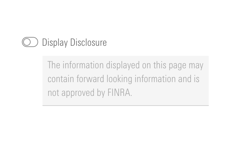
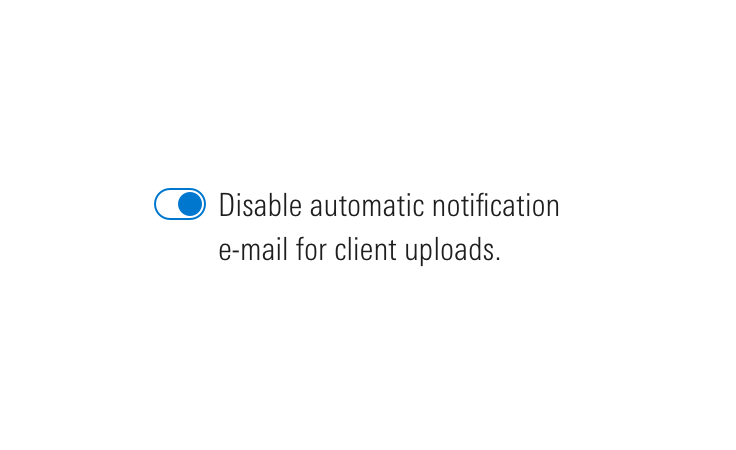
- Turning on and off a feature, mode, or functionality.
- Toggling elicits an immediate change in the UI.
- Toggling elicits a change in background behavior without affecting the UI.
Don’t Use When
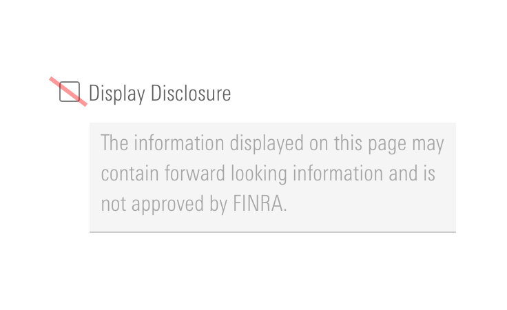
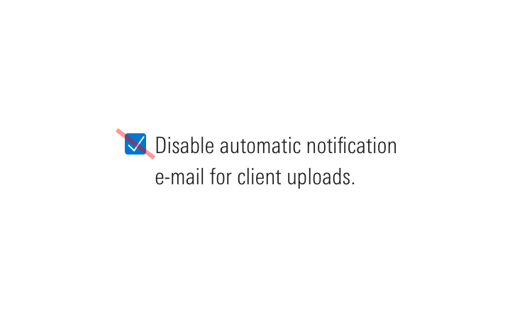
- Requiring user action consent, such as accepting terms and conditions. Instead, use a Form checkbox.
- Requesting multiple choices from a group of options. Instead, use a Form checkbox group.
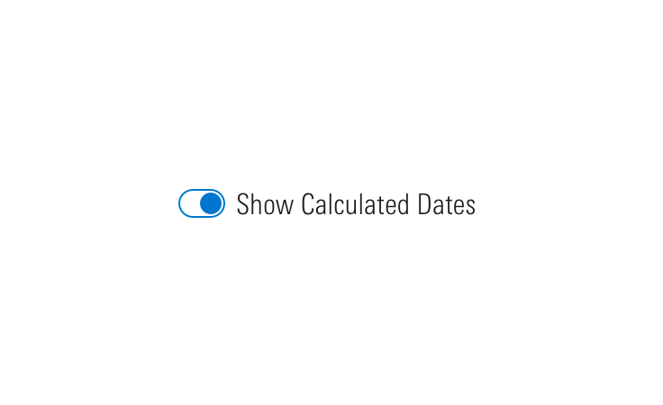

Visual Language
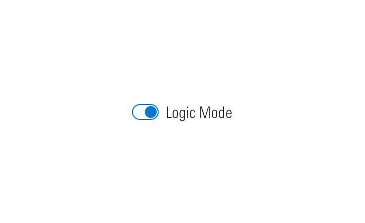
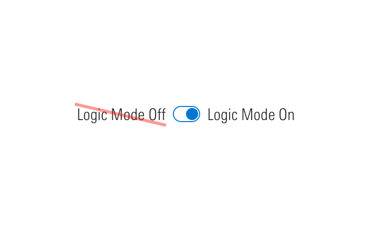
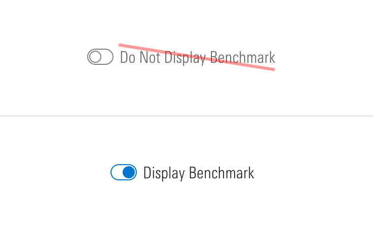
Behaviors
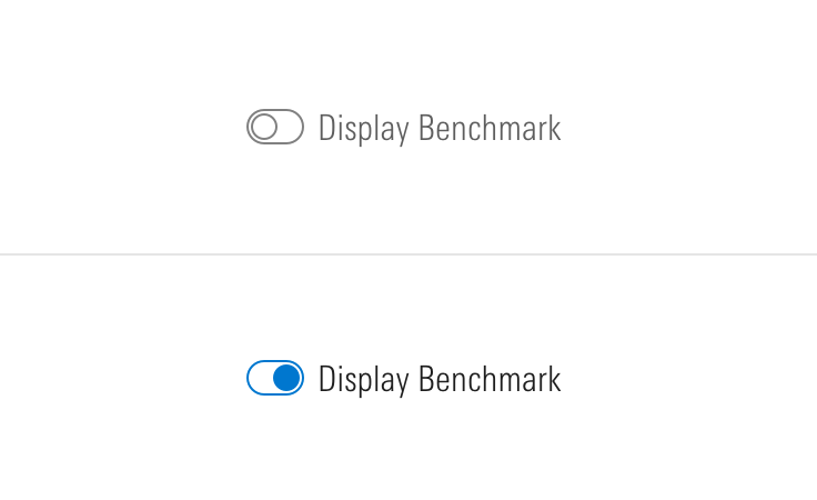
Editorial
- Avoid acronyms.
- Aim for 2 to 5 words.
- When using a switch to control a “Mode”, make sure your modifier is specific and maps well to a user’s expectation once the switch is turned on.
- Do: Logic Mode
- Don't: Beast Mode
Related UX Patterns
CSS
Class References
|
Class
|
Applies to
|
Outcome
|
|---|---|---|
|
|
|
At parent level, this applies base-switch styles to an element. |
|
|
|
Adjusts styling to render a small switch. |
|
|
|
Adjusts styling to render a large switch. |
|
|
|
Adjusts styling to render a touch switch. |
|
|
|
Hides label text although text is still readable by screen readers. |
|
|
|
Semantically structures a group of switches. Always include |
|
|
|
Apply to a parent wrapper of a fieldset to convert switches layout from vertical to horizontal. |
Mixins
Touch Properties
Use this mixin to create media queries in your product styles to change switches to their touch variation.
@include mds-switch-touch-properties();For example, switching to the touch variation on screens with a max-width of 500px:
// Your product SCSS
@media screen and (max-width: 500px) {
    @include mds-switch-touch-properties();
}- The mixin includes all CSS properties required to convert any size into the touch variation.
- Use a media query that makes the most sense for your product, in addition to
max-width,pointer: coarseis another helpful method for targeting touch screen devices. - If you don’t want every instance to change, consider using a wrapping class around the media query to target specific elements in your product.
Web Component
Switches are comprised of two separate web components, each with a dedicated API:
- Switch - Renders the switch component and offers props for all offered variations and behaviors.
- Switch Group - Wraps multiple
<mds-switch>elements to present them as a group.
Switch
Props
When setting props as attributes on a custom HTML element, use kebab-case instead of camelCase.
|
Prop
|
Type
|
Validation
|
Default
|
Description
|
|---|---|---|---|---|
|
|
String |
— |
— |
A space-separated list of class names that will be appended to the default |
|
|
Boolean |
— |
|
Sets the |
|
|
Boolean |
— |
|
If |
|
|
Boolean |
— |
|
If |
|
|
String |
Required |
— |
Sets the |
|
|
String |
One of: |
|
Alters the size of the switch. |
|
|
String |
Required |
— |
The label text for the switch. Can also be passed via the default slot. |
|
|
String |
— |
— |
Sets the |
Slots
Default Slot
Any text passed in between the <mds-switch></mds-switch> tags will be used as the text content.
Usage Examples
Setting text, checked, and size via props:
<mds-switch name="switch_name" text="Switch Label" size="large" checked></mds-switch>Switch Group
Props
When setting props as attributes on a custom HTML element, use kebab-case instead of camelCase.
|
Prop
|
Type
|
Validation
|
Default
|
Description
|
|---|---|---|---|---|
|
|
String |
— |
— |
A space-separated list of class names that will be appended to the default |
|
|
String |
— |
— |
A space-separated list of element |
|
|
String |
Required |
— |
Label for the switch group. |
Slots
Default Slot
Pass two or more <mds-switch> elements between the <mds-switch-group></mds-switch-group> tags to set the content of the switch group.
Usage Examples
Setting label via a prop. Using the default slot for the switches in the group:
<mds-switch-group label="Choose your options">
    <mds-switch name="switch_name">Switch Label 1</mds-switch>
    <mds-switch name="switch_name">Switch Label 2</mds-switch>
</mds-switch-group>
Implementation Tips
Sticky Hover State on Touch Screens
On touch screens, :hover states “stick” after tapping an interactive element. To counter this behavior, MDS provides a mixin that resets component hover states to their default styles:
@include mds-sticky-hover-reset();The mixin uses a media query based on hover: none to target touch screen devices and includes resets for Buttons, Checkboxes, Inputs, List Groups, Radio Buttons, Search Fields, Selects, Switches, and Textareas. You can apply this mixin within your product’s media queries along with other MDS touch styles, for example:
// Your product SCSS
@media screen and (max-width: 500px) {
    @include mds-sticky-hover-reset();
    @include mds-componentName-touch-properties();

    // The rest of your product’s responsive/touch styles...
}Implementation
- Always include a label even if it is hidden from the screen, to ensure there is descriptive text present for assistive technologies.
Best Practices
- By default, switches include a
role="switch"ARIA attribute to ensure they are accurately announced via assistive technologies. - By default, switch groups include a
role="group"on the<fieldset>wrapping grouped switches. - Switch can be triggered by pressing
spacebar.

