The Morningstar Design System is a collection of brand, visual, UX, and technical standards built into a central library so that teams can quickly build high-quality, consistent experiences.
Coming in 2020, the full library of MDS UI components will be re-engineered and available as Vue components and the existing library of V2 web components will be deprecated. The new release will also feature a modular architecture, a redesigned documentation site, and many other updates and enhancements.
To learn more about why we are making these changes and what they mean for product teams, read this blog post.

New constants, new documentation, and updated UI component interactions provide the foundation for animation in the Morningstar Design System.

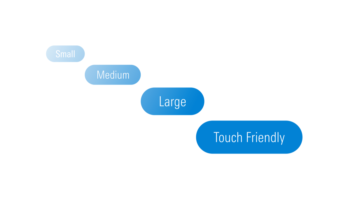
MDS now offers touch target-sized variations of many components—like Buttons, Forms, and List Groups—providing products with the parts to build accessible touch-screen experiences. See our release notes for a full list of supported components.

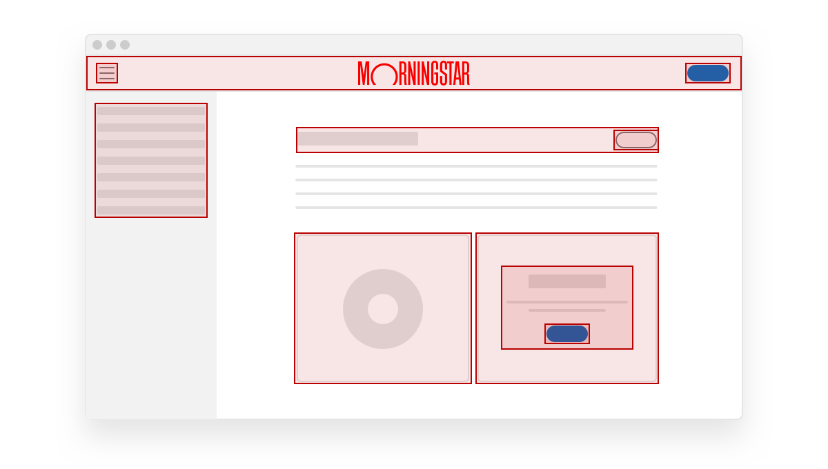
The MDS Coverage Tool allows product teams to assess their MDS adoption by highlighting MDS components used within an application. Click the button below to learn more.

- Complete
- In Progress
- Upcoming
|
Status
|
Item
|
|---|---|
| Coverage tool | |
| Stress-testing tool | |
| Coverage dashboard |
|
Status
|
Item
|
|---|---|
| MDS Components for Vue | |
| Component packaging | |
| Enhanced Data Table |
|
Status
|
Item
|
|---|---|
| Consolidate to single set of icons | |
| Refresh style (stroke width, etc.) | |
| Redesign selected icons |
|
Status
|
Item
|
|---|---|
| Establish working group | |
| Principles and objectives | |
| Road map & prioritization |

The Morningstar Design System is powered and improved by the teams that use it. We’d love to hear your feedback.

