Search Fields
Search Fields
- HTML/CSS Available
- Web Component Deprecated
- Last Updated
2.23.0
Search fields allow a user to type in exactly what they’re looking for.
Variations
Primary
Use when search is a major function of a page.
<!-- Default -->
<div class="mds-search-field " role="search">
    <input type="text" class="mds-search-field__input" aria-label="Search" placeholder="Search for Security">
    <svg class="mds-icon mds-search-field__search-icon" aria-hidden="true">
        <use xlink:href="#search--s">
        </use>
    </svg>
    <span class="mds-search-field__input-focus-outline"></span>
</div>
<!-- With Value -->
<div class="mds-search-field " role="search">
    <input type="text" class="mds-search-field__input" aria-label="Search" placeholder="Search..." value="Apple">
    <svg class="mds-icon mds-search-field__search-icon" aria-hidden="true">
        <use xlink:href="#search--s">
        </use>
    </svg>
    <button class="mds-button mds-search-field__clear-button mds-button--small mds-button--icon-only" type="button" aria-label="Clear search field">
        <svg class="mds-icon mds-button__icon mds-button__icon--right" aria-hidden="true">
            <use xlink:href="#remove--s">
            </use>
        </svg>
    </button>
    <span class="mds-search-field__input-focus-outline"></span>
</div>
<!-- Disabled -->
<div class="mds-search-field " role="search">
    <input type="text" class="mds-search-field__input" aria-label="Search" placeholder="Search for Security" disabled>
    <svg class="mds-icon mds-search-field__search-icon" aria-hidden="true">
        <use xlink:href="#search--s">
        </use>
    </svg>
    <span class="mds-search-field__input-focus-outline"></span>
</div>
<!-- Default -->
<mds-search-field placeholder="Search for Security"></mds-search-field>
<!-- With Value -->
<mds-search-field placeholder="Search for Security" value="Apple"></mds-search-field>
<!-- Disabled -->
<mds-search-field placeholder="Search for Security" disabled></mds-search-field>Secondary
Use in most cases, when search is a supplemental function on a page.
<!-- Default -->
<div class="mds-search-field mds-search-field--secondary" role="search">
    <input type="text" class="mds-search-field__input" aria-label="Search" placeholder="Search for Security">
    <svg class="mds-icon mds-search-field__search-icon" aria-hidden="true">
        <use xlink:href="#search--s">
        </use>
    </svg>
    <span class="mds-search-field__input-focus-outline"></span>
</div>
<!-- With Value -->
<div class="mds-search-field mds-search-field--secondary" role="search">
    <input type="text" class="mds-search-field__input" aria-label="Search" placeholder="Search..." value="Apple">
    <svg class="mds-icon mds-search-field__search-icon" aria-hidden="true">
        <use xlink:href="#search--s">
        </use>
    </svg>
    <button class="mds-button mds-search-field__clear-button mds-button--small mds-button--icon-only" type="button" aria-label="Clear search field">
        <svg class="mds-icon mds-button__icon mds-button__icon--right" aria-hidden="true">
            <use xlink:href="#remove--s">
            </use>
        </svg>
    </button>
    <span class="mds-search-field__input-focus-outline"></span>
</div>
<!-- Disabled -->
<div class="mds-search-field mds-search-field--secondary" role="search">
    <input type="text" class="mds-search-field__input" aria-label="Search" placeholder="Search for Security" disabled>
    <svg class="mds-icon mds-search-field__search-icon" aria-hidden="true">
        <use xlink:href="#search--s">
        </use>
    </svg>
    <span class="mds-search-field__input-focus-outline"></span>
</div>
<!-- Default -->
<mds-search-field variation="secondary" placeholder="Search for Security"></mds-search-field>
<!-- With Value -->
<mds-search-field variation="secondary" placeholder="Search for Security" value="Apple"></mds-search-field>
<!-- Disabled -->
<mds-search-field variation="secondary" placeholder="Search for Security" disabled></mds-search-field>Sizing
Sizing affects search field size, text size, icon size, and internal spacing. The default size is medium, and you can use modifier classes or props to make the search field smaller or larger.
<div class="mds-search-field mds-search-field--secondary mds-search-field--small" role="search">
    <input type="text" class="mds-search-field__input" aria-label="Search" placeholder="Search for Security">
    <svg class="mds-icon mds-search-field__search-icon" aria-hidden="true">
        <use xlink:href="#search--s">
        </use>
    </svg>
    <span class="mds-search-field__input-focus-outline"></span>
</div>
<mds-search-field variation="secondary" size="small" placeholder="Search for Security"></mds-search-field>- See mixin documentation for additional details on how to create media queries to switch to the touch size.
Use When
- Searching for content in an entire app or site.
- Searching within and filtering down a large List Group of options.
- Searching within a more specific set of data, i.e., Morningstar Research or Morningstar Reports.
Visual Language
- Research suggests that the width of the input field has an impact on search usability. A general rule of thumb is that the input, when active, should accommodate 27 characters.
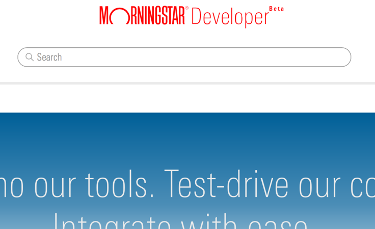
- Use primary search fields when search is a top-level method of navigation.
 Global search functionality on Morningstar.com.
 Component search functionality on Morningstar Developer.
 Global search functionality on Morningstar Credit Ratings.
- Use secondary search fields for non-global searches.
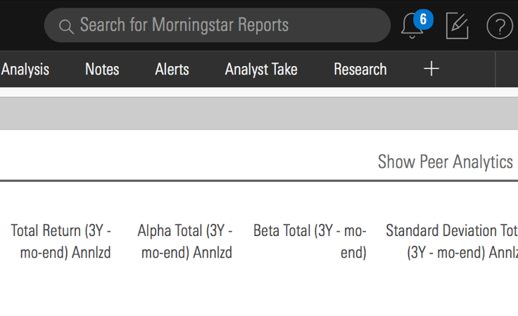 Searching for reports inside Direct Cloud.
 Searching within Research Portal inside Direct Cloud.
- Use secondary search fields within a Menu.
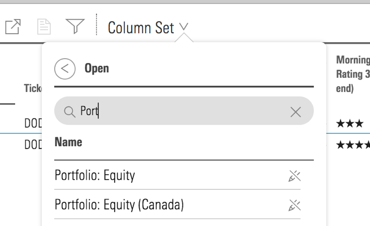 Example of searching within column sets Menu inside Direct Cloud.
- Use placeholder text to provide additional context around the data being searched. For example, “Search for Morningstar Reports”.
Behaviors
- Enable search query to execute when a user presses
Enter. - When a user enters text in the field, a remove icon,
remove--s, allows the user to clear their entry. For live search, clicking the remove icon also clears the results of the current search. - In IE11, search field placeholder text is cleared on
focus. This is default IE11 behavior and a known issue, teams are still encouraged to use search fields in production.
Editorial
- Briefly describe what the user might search for in the placeholder text, if space permits. For example, “Search for ETFs, Research, and Reports”.
- If there’s not enough space to express a complete thought, use “Search…”
- Use “Search for” not “Search by”—reserve “by” for filtering, i.e., “Filter by sector”.
- Use title case and don't end sentences with periods.
- Show searched term(s) when showing results.
Related UX Patterns
CSS
Class References
|
Class
|
Applies to
|
Outcome
|
|---|---|---|
|
|
|
Renders the search field using the secondary style. |
|
|
|
Adjusts styling to render a small search field. |
|
|
|
Adjusts styling to render a large search field. |
|
|
|
Adjusts styling to render a touch search field. |
Mixins
Touch Properties
Use this mixin to create media queries in your product styles to switch search fields to their touch variation.
@include mds-search-field-touch-properties();For example, switching to the touch variation on screens with a max-width of 500px:
// Your product SCSS
@media screen and (max-width: 500px) {
    @include mds-search-field-touch-properties();
}- The mixin includes all CSS properties required to convert any size into the touch variation, including styling to resize the search field icon. However, the mixin doesn’t update the underlying icon file used. To avoid undesirable scaling, DOM manipulation via JavaScript is required to update the search field icon. This is only an issue when switching from small or medium to touch. Consider using the web component and programmatically updating the
sizeprop, which automatically updates the icon used. - Use a media query that makes the most sense for your product, in addition to
max-width,pointer: coarseis another helpful method for targeting touch screen devices. - If you don’t want every instance to change, consider using a wrapping class around the media query to target specific elements in your product.
Web Component
Props
When setting props as attributes on a custom HTML element, use kebab-case instead of camelCase.
|
Prop
|
Type
|
Validation
|
Default
|
Description
|
|---|---|---|---|---|
|
|
String |
— |
— |
A space-separated list of class names that will be appended to the default |
|
|
String |
— |
Search |
Sets the aria-label for the search field. |
|
|
String |
— |
Clear search field |
Sets the aria-label on the icon-only clear button. |
|
|
Boolean |
— |
|
If |
|
|
String |
— |
Search... |
Adds placeholder text. |
|
|
String |
One of: |
|
Alters the size of the search field. |
|
|
String |
— |
— |
Text value for the search field. If omitted, the placeholder will be displayed by default. |
|
|
String |
One of: |
|
Sets the search field variation. |
Methods
|
Method Name
|
Description
|
|---|---|
|
|
Removes the value from the search field. |
Usage Examples
Setting variation and size via props:
<mds-search-field variation="secondary" size="small"></mds-search-field>Setting placeholder and value via props:
<mds-search-field placeholder="Custom Placeholder Text" value="Predefined Value"></mds-search-field>Implementation Tips
Sticky Hover State on Touch Screens
On touch screens, :hover states “stick” after tapping an interactive element. To counter this behavior, MDS provides a mixin that resets component hover states to their default styles:
@include mds-sticky-hover-reset();The mixin uses a media query based on hover: none to target touch screen devices and includes resets for Buttons, Checkboxes, Inputs, List Groups, Radio Buttons, Search Fields, Selects, Switches, and Textareas. You can apply this mixin within your product’s media queries along with other MDS touch styles, for example:
// Your product SCSS
@media screen and (max-width: 500px) {
    @include mds-sticky-hover-reset();
    @include mds-componentName-touch-properties();

    // The rest of your product’s responsive/touch styles...
}Implementation
- Use the
aria-labelattribute to define the text that assistive technology uses to describe the search field element. By default it is set to “Search”.
Best Practices
- Search fields should always use
role="search".