Search
Search is used to find or add objects, filter a list of results, or navigate to destinations.

Problem Statement
Users need to be able to quickly find what they need or reach their intended destination. Search can make these tasks easier by clearly showing relevant results.
Types
There are many different kinds of search functionality that help users accomplish a variety of goals. These kinds can be most clearly broken down into two types, Global Search and Contextual Search.
Global Search
Global search is typically accessible from every page of an experience. Users can utilize it perform broad searches which span across a product. In many cases, global search serves as a navigational starting point for a user, providing them options in terms of where to go and what to do. When it serves as the primary starting point for a user, it should be the most discoverable element on a page.
 Global search on a product home page.
When it is available within the context of other user flows, research suggests that users typically expect to see a global search field within the header.
 Global search in a product masthead.
Contextual Search
Contextual search is specific to a task and is often embedded within particular features and tools. The scope of contextual search is more narrow than that of the global search. Users should only see results relevant to the task they are trying to accomplish. It can be used to help a user with a variety of tasks, like filtering objects in a list or finding objects so they can be added to a set.
Filtering
When search is used to filter a set of results in order to find an object, the results should update in real-time as a user types.
If updating filter results in real time is not possible, the Search Field must be accompanied by a Button to execute the query. This button should be disabled by default and become active once a user types into the search field.
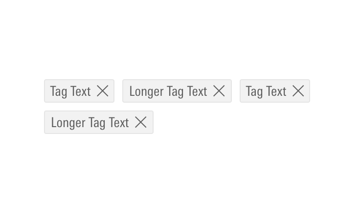
When adding multiple filters, display each as a Dismissible Tag below the search field. This enables a user to see their current filters and remove them as needed.
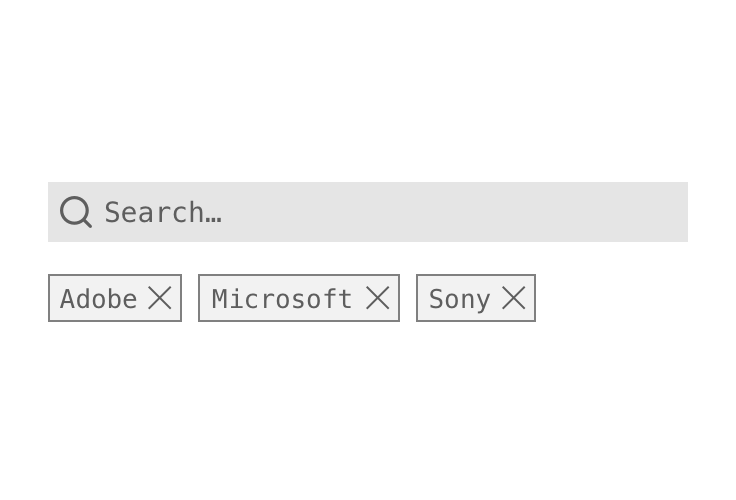 Using Dismissible Tags to represent current filtering criteria.
Adding to a List
When the main use case is to add a single object, search results should close upon selection of the object.
When using contextual search to add multiple objects, checkboxes should be used to provide users with that functionality. Users must manually dismiss these searches by clicking outside of the panel or on an action button, e.g., a “Done” or “Cancel” button.
Search Fields
Focus
If the main purpose of the page is to search for an object, put the search field into focus by default to make searching easier for the user.
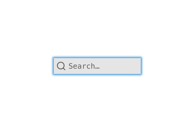 Focused Search Field.
Placeholder Text
Use consistent language in search field placeholder text to reduce cognitive friction and help users quickly identify what types of content they can search for.
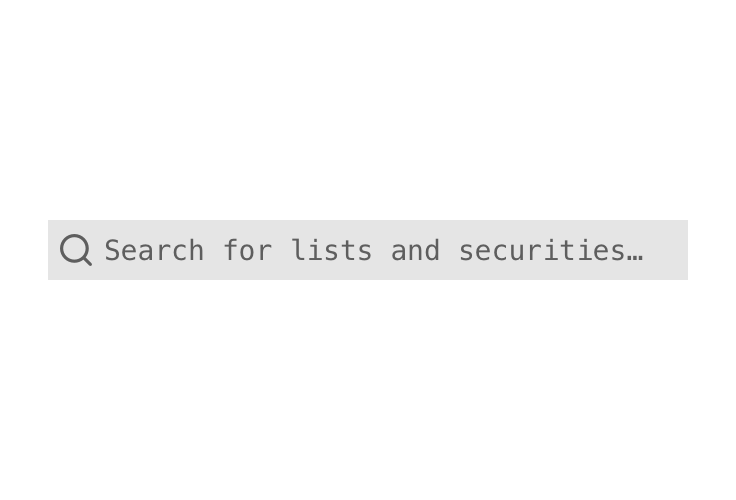 Placeholder text in Search Field.
Search Results
Depending on context, search results may appear inline or layered on top of other page content. When deciding between the two, think about the importance of the search to the page:
- If search is the primary action a user is supposed to take, search should appear inline within the composition.
- If searching is supplementary or only one of the many actions a user can take, search results may appear layered on top of other page content.
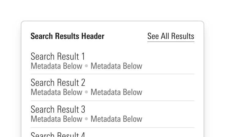
Search results should be displayed using the Search Results components unless there is a more appropriate component already existing within a composition, e.g., when a user is using search to filter items displayed in a data table.
Inline
Use when the search results are the main focus of the user, e.g.:
- The whole page is primarily designed to search and add objects.
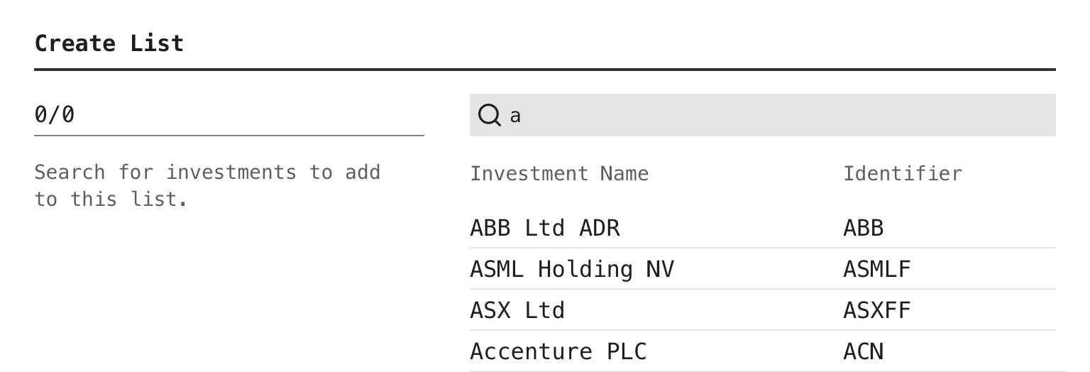 Inline search results on a page primarily intended for searching.
- Search is used to filter a longer list of items that are displayed on a page.
 Inline search results when filtering a data table.
Layered
Use when searching is one action among many that a user can perform on the page. This allows search results to appear and disappear as needed, without unpredictably moving content on the rest of the page.
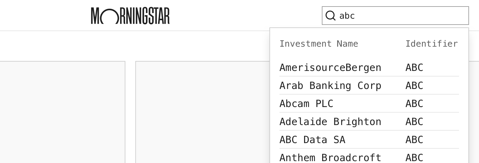 Layered search results triggered by global search.
Additional Guidance
- When initially triggering or updating search results based on a user’s input into a Search Field, teams should carefully consider how they determine when search results appear. Potential timings include:
- When a user presses
Enterwhile in the search field or presses a related button intended to execute the search. - When a user is “done” typing, this can be achieved by listening for a significant pause in a user’s input and then displaying the search results.
- When a user has input enough characters to return a specific set of results. The number of characters should be determined by the kind of items a user is likely to search for, e.g., If a user may be searching by an investment’s ticker, triggering the search after 1 character may be reasonable. If a user is likely to be searching for longer terms, then triggering the search after 3 characters may be a better solution.
- When a user presses
- When search results will take more than 1 second to populate, consider placing a Loader in place of the results.
- When possible, highlight the text which matches the search query, e.g., the Text Match in the search results component.
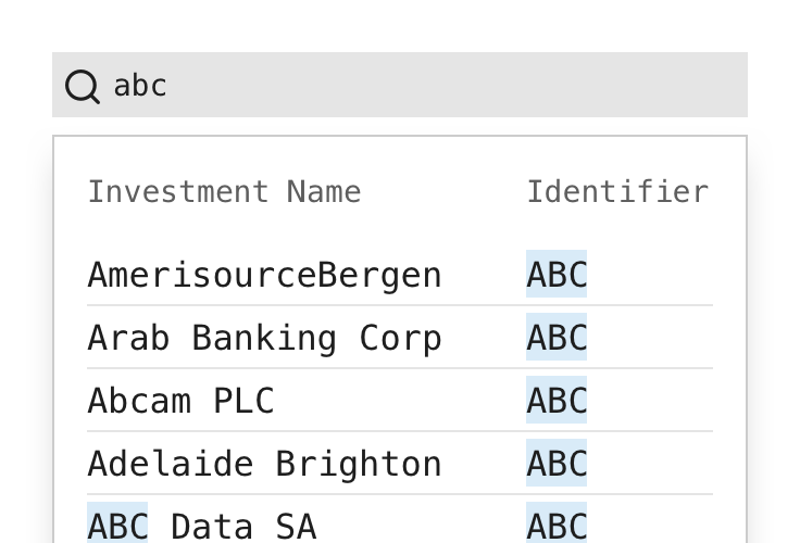 Highlighting the text in search results which match the query.
- When helpful to the user, show the number of returned results.
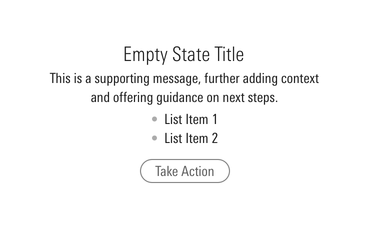
- When there are no results found, use the Empty State component to provide clear messaging to the user. Make the message visible by prominently placing it where results would appear and always offer ways for the user to move forward.
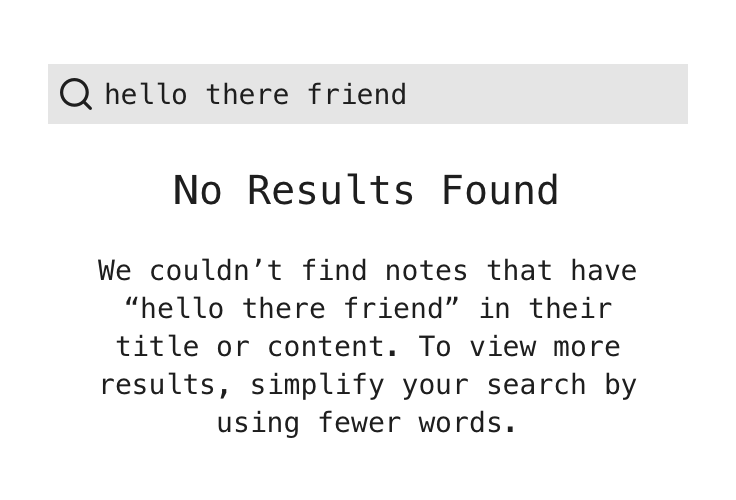 Offering ways for a user to move forward when a search has no results.


