Module Containers
Module containers structure content by grouping various elements to provide cohesive sets of information and functionality.
Module Container
Press Ctrl + C to copy
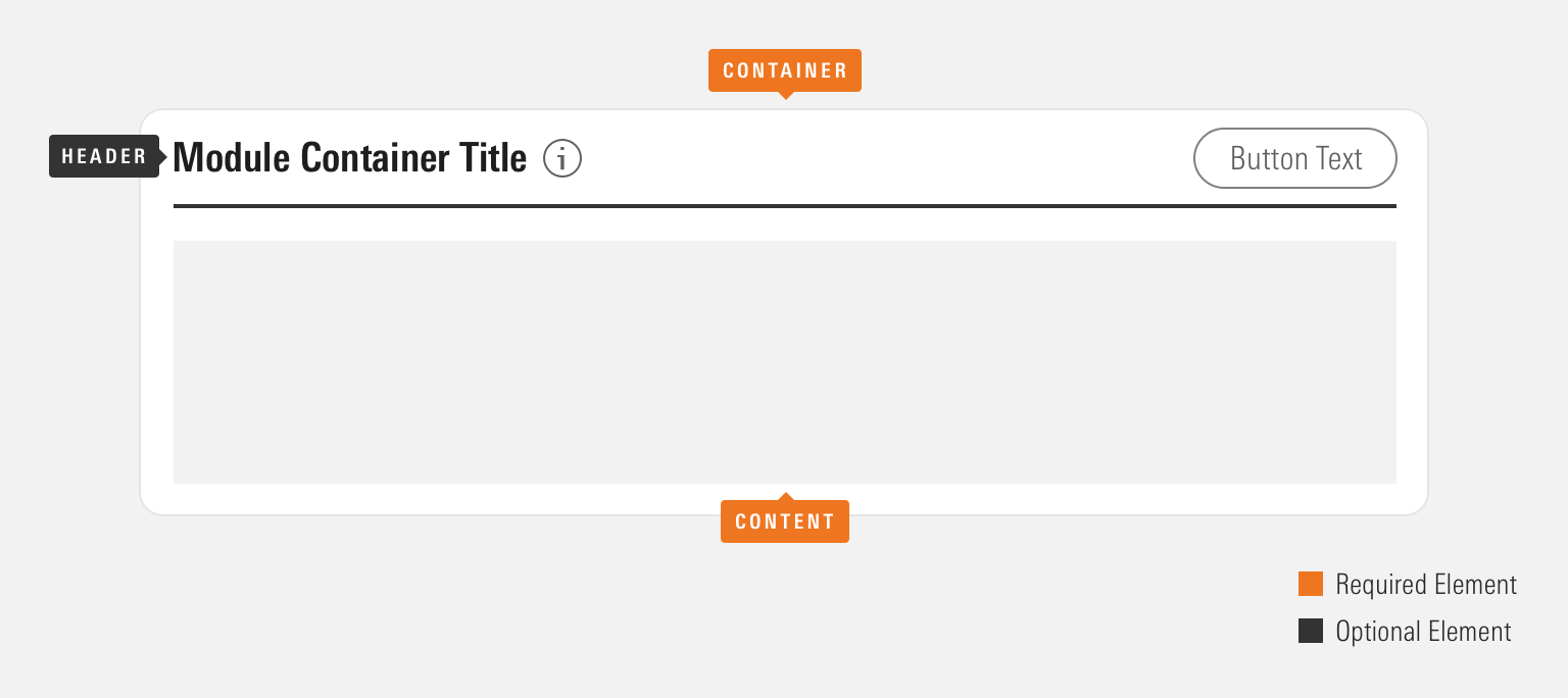
Anatomy
Module containers can be configured in a variety of ways to accomplish their intended goal. Implementing teams are encouraged to use the particular set of elements which best serve their use case.
|
Name |
Required |
Description |
|---|---|---|
|
Container |
Yes |
Visually defines the module container’s dimensions. |
|
Content |
Yes |
Displays a defined composition of elements. |
|
Header |
No |
Includes a Header component. |
Default
Module Container Title
[Your content here.]
Press Ctrl + C to copy
<div class="mds-module-container">
    <div class="mds-header mds-header--primary mds-header--border-bottom">
        <h2 class="mds-header__title"> Module Container Title </h2>
        <div class="mds-header__actions">
            <button class="mds-button mds-button--secondary" type="button"> Action </button>
        </div>
    </div>
    <section class="mds-module-container__content">
        <div class="mds-placeholder-text">[Your content here.]</div>
    </section>
</div>- See the Headers documentation for all available variations and additional guidelines.
Without Header
Use to compose a set of content and/or functionality.
Without Header
[Your content here.]
Press Ctrl + C to copy
<div class="mds-module-container">
    <section class="mds-module-container__content">
        <div class="mds-placeholder-text">[Your content here.]</div>
    </section>
</div>- Consider creating visual hierarchy inside of a without-header module container through the use of typography and borders.
Sizing
Module containers come in a single size. However, they can consume any size of Header.
Header Level 4
Module Container Title
[Your content here.]
Header Level 5
Module Container Title
[Your content here.]
Header Level 6
Module Container Title
[Your content here.]
Press Ctrl + C to copy
<div class="mds-module-container">
    <div class="mds-header mds-header--primary mds-header--level-4 mds-header--border-bottom">
        <h2 class="mds-header__title"> Module Container Title </h2>
        <div class="mds-header__actions">
            <button class="mds-button mds-button--secondary" type="button"> Action </button>
        </div>
    </div>
    <section class="mds-module-container__content">
        <div class="mds-placeholder-text">[Your content here.]</div>
    </section>
</div>- Always follow Headers sizing guidelines when implementing a Header inside of module containers.
Guidelines
Use When
- Creating a discrete set of content and functionality.
- Grouping a large set of related information.
- Organizing multiple sets of content to compose a full page.
Don't Use When
- Constructing a set of content and functionality layered on top of an underlying page. Instead, use a Modal.
- Providing a set of content which acts as an entry point to more detailed information. Instead, use a Card.
- Grouping information within another module container.
Visual Language
- Module Container dimensions are based on its content and the container in which it resides.
- Apply customs heights and widths to meet product requirements.
- Module containers always use
$mds-background-color-whiteas their background color. If requirements call for a different background color, work with a designer to create custom styles within your product’s CSS, which utilize the MDS background color constants.
Behaviors
- Ensure functionality within a module container’s Header directly relates to the contents contained by the component.
Editorial
- Follow the Header component editorial guidelines when implementing a Header within a module container.
Accessibility
- If a module container includes a Header, add a unique ID to the
mds-header__titleand reference it in themds-module-container__contentelement using thearia-labelledbyattribute.
<div class="mds-module-container">
    <div class="mds-header mds-header--primary">
        <h2 class="mds-header__title" id="title-header-1"> [Module Container Title]
            <div class="mds-header__title-description">
                <button class="mds-button mds-button--icon-only" type="button">
                    <svg class="mds-icon mds-button__icon mds-button__icon--left" aria-hidden="true">
                        <use xlink:href="/icons/mds.svg#question-circle"> </use>
                    </svg>
                </button>
            </div>
        </h2>
        <div class="mds-header__actions">
            <button class="mds-button mds-button--secondary" type="button"> Action </button>
        </div>
    </div>
    <section class="mds-module-container__content" aria-labelledby="title-header-1">
        <div>[Your content here.]</div>
    </section>
</div>- Follow all Header component accessibility guidelines.
Code Reference
CSS Class References
- See the Headers page for modifier class documentation.