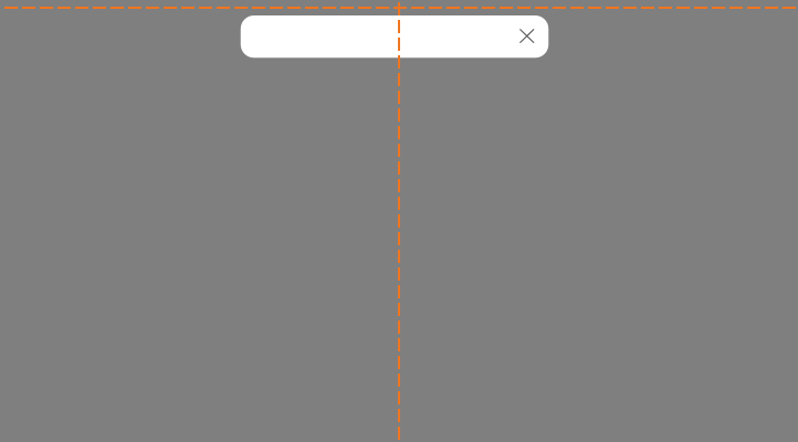
Notifications highlight that an event has occurred.
Use when relaying non-critical information pertaining to a user's action.
<div role="alert" class="mds-notification mds-notification--with-close-button mds-container--white ">
    <div class="mds-notification__message">Your report is being generated.</div>
    <button type="button" class="mds-notification__close-button mds-button mds-button--small mds-button--icon-only" aria-labelledby="title">
        <svg class="mds-icon mds-button__icon" aria-labelledby="title">
            <title>remove--s</title>
            <use xlink:href="/assets/icons/mds_icons.svg#remove--s"></use>
        </svg>
    </button>
</div>Use when the notification contains an “Undo” option, or a follow-up action via a button or link.
<div role="alert" class="mds-notification mds-notification--with-close-button mds-container--white ">
    <div class="mds-notification__message">1,134 items have been deleted.
        <button class="mds-button mds-button--small" type="button" role="button"> Undo </button>
    </div>
    <button type="button" class="mds-notification__close-button mds-button mds-button--small mds-button--icon-only" aria-labelledby="title">
        <svg class="mds-icon mds-button__icon" aria-labelledby="title">
            <title>remove--s</title>
            <use xlink:href="/assets/icons/mds_icons.svg#remove--s"></use>
        </svg>
    </button>
</div> Appropriate placement of a notification.
remove--s.role="alert" attribute on the mds-notification element.role="dialog" when the notification also provides interactive controls, such as an “Undo” button, that provide feedback and dismiss the notification.remove--s.| Class | Applies to | Outcome |
|---|---|---|
|
|
|
Indicates the notification component to layout the block with close button, so that the notification text will not overlap the close button at the right. |
|
|
|
Indicates the notification is a popup. |
|
|
|
Hides the notification popup, will animate fade-in effect of notification upon removal of this class. |