Color is an integral aspect of conveying clear concise data. Our colors are optimized across four backgrounds, meeting or exceeding WCAG 2.0 Level AA Accessibility Guidelines.
Our neutrals have been streamlined for on-screen use. They are organized by lightness value from Black (0) to White (100).
Use feedback colors to reinforce user action. Color alone is not sufficient to meet WCAG 2.0 Level AA Accessibility Guidelines. An additional affordance, such as an Icon, must be included.
Always pair with mds-text-color-white when used as a background color.
Always pair with mds-text-color-primary-on-light when used as a background color.
Background colors work in pairs to establish visual hierarchy.
Primary backgrounds always contain the product’s focal point. The user is doing most of their work on this background.
Secondary backgrounds offer visual rest from primary backgrounds. They often contain auxiliary elements such as side navigation, card backgrounds, registration forms, or ad-unit containers.
The MDS site uses the secondary-background for the navigation on the left. The site’s content is contained in the primary-background area.
Morningstar.com uses the secondary-background to contain ad units. This helps separate ad units from editorial content.

Use to establish interactivity and hierarchy between UI components (i.e., mds-button--primary versus mds-button).
$mds-text-white when used as a background color.$mds-background-color-interactive-default for text, as this creates an optical imbalance with interactive objects.$mds-background-color-interactive-dark and $mds-background-color-interactive-darker for hover and active states.Text on any background color must have a minimum foreground-to-background contrast ratio of 4.5:1. This ensures compliance with WCAG 2.0 Level AA Accessibility Guidelines.
Brand logos and disabled text do not have a minimum contrast ratio. All other content, including placeholder text, must meet or exceed 4.5:1.
Use for fundamental text, such as body copy, Data Table cell data, and List Group items.
Use for supportive text, such as placeholder text in Forms, Data Table column headers, and metadata.
In this example, mds-text-color-secondary-on-light is used for text box placeholder text in Forms, as well as for the readout of disclosure information in small type (metadata).
Use to highlight errors. This color is under evaluation, as it doesn’t meet Accessibility benchmarks.
Use to indicate components that cannot be used. Disabled components are exempt from minimum contrast ratios.
Use the @include disabled-text(text-color) mixin on a component to render the disabled text color.
Borders define and structure content.
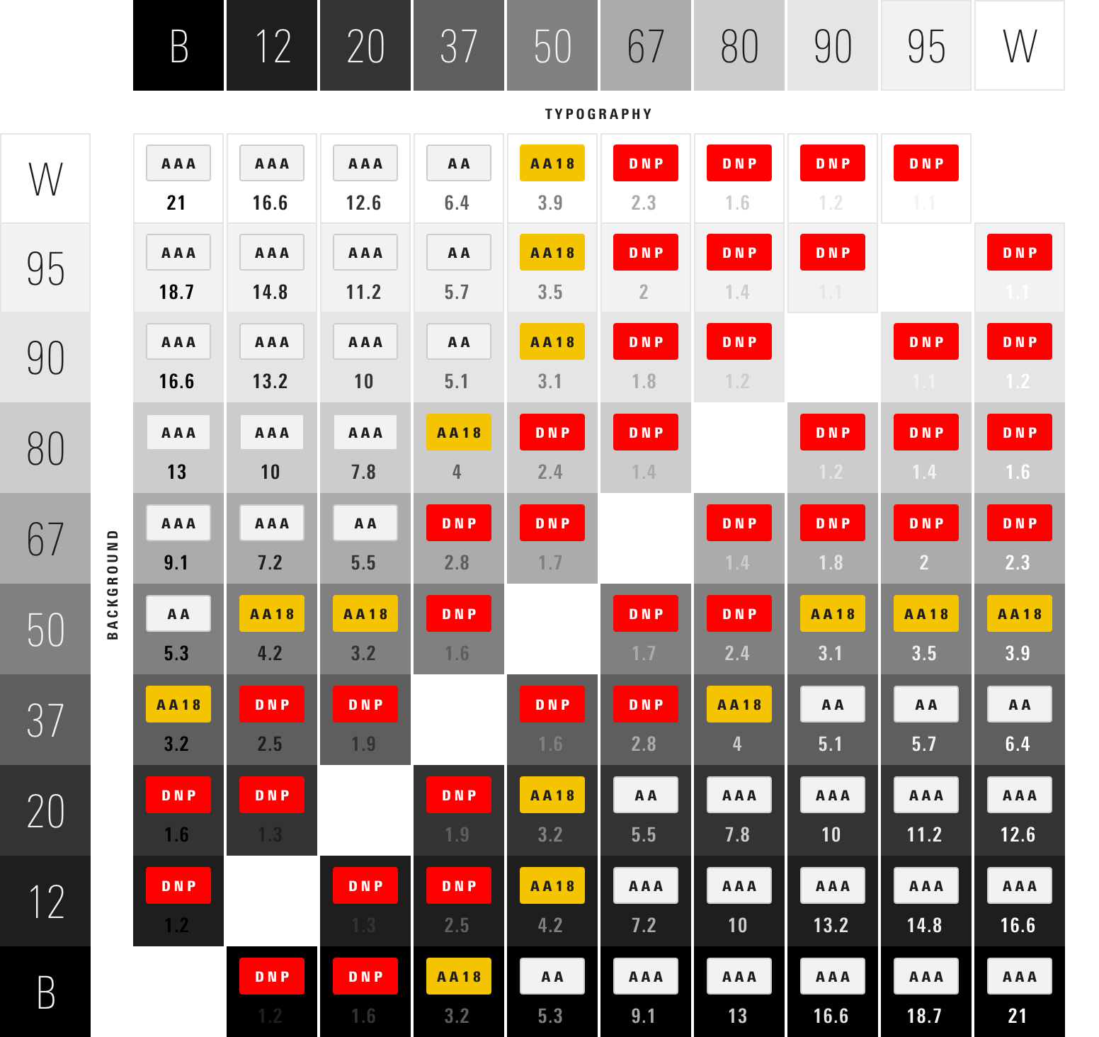
Color contrast refers to the difference between foreground and background. The World Wide Web Consortium established specific color-contrast ratios for achieving compliance. The guidelines are split into three levels: A, AA, and AAA. The organizational benchmark for Morningstar products is Level AA.
The color decisions shared here reflect an adherence to a contrast ratio of at least 4.5:1. When possible, we recommend a ratio near 5.5:1, just to be safe. Never use any combinations that do not meet Level AA Guidelines.
Rating |
Description |
|---|---|
|
AAA
|
Passes Level AAA Guidelines at all sizes. Minimum contrast ratio ≥ 7.0:1. |
|
AA
|
Passes Level AA Guidelines at all sizes. Minimum contrast ratio ≥ 4.5:1. |
|
AA18
|
Passes Level AA Guidelines only at ≥18px type size or bold weight. Minimum contrast ratio ≥ 3.0:1. |
|
DNP
|
Does not pass Level AA Guidelines. Do not use. |
The table above is reproduced from W3C’s Web Content Accessibility Guidelines 2.0.
Subtlety and refinement are integral to our visual language, however, ensuring that our content is legible takes precedent. The successes and failures below guided System color decisions.