Modals
- HTML/CSS Available
- Web Component In Progress (MDS-4696)
- Last Updated
2.0.0
Modals gather information, complete a subtask, or provide additional information without losing the context of an underlying page.
Variations
Default
Use when displaying information that does not require a user action, such as a read-only document or a supplemental video.
<div class="mds-modal">
    <div class="mds-modal__wrapper">
        <section role="dialog" aria-labelledby="title-modal-1" class="mds-modal__container" aria-hidden="true">
            <div class="mds-modal__inner">
                <header class="mds-modal__header">
                    <div class="mds-modal__actions">
                        <button class="mds-button mds-button--icon-only">
                            <svg class="mds-icon mds-button__icon mds-button__icon--left">
                                <use xlink:href="/icons/mds.svg#question-circle">
                                    <title>Help</title>
                                </use>
                            </svg>
                        </button>
                        <button class="mds-button mds-button--icon-only">
                            <svg class="mds-icon mds-button__icon mds-button__icon--left">
                                <use xlink:href="/icons/mds.svg#print">
                                    <title>Print</title>
                                </use>
                            </svg>
                        </button>
                        <button class="mds-button mds-button--icon-only">
                            <svg class="mds-icon mds-button__icon mds-button__icon--left">
                                <use xlink:href="/icons/mds.svg#remove">
                                    <title>Close</title>
                                </use>
                            </svg>
                        </button>
                    </div>
                    <h1 class="mds-modal__title" id="title-modal-1"> Dismissible Modal </h1>
                </header>
                <div class="mds-modal__content">
                    <p>I am a dismissible modal that displays non-essential information.</p>
                </div>
            </div>
        </section>
    </div>
</div>- Include a close icon,
remove, within the header, on the right. - Dismiss a modal by:
- Clicking the close icon,
remove. - Pressing
escape. - Clicking outside the modal.
- Clicking the close icon,
No Title
<div class="mds-modal">
    <div class="mds-modal__wrapper">
        <section role="dialog" aria-labelledby="title-modal-1" class="mds-modal__container" aria-hidden="true">
            <div class="mds-modal__inner">
                <header class="mds-modal__header mds-modal__header--no-title">
                    <div class="mds-modal__actions">
                        <button class="mds-button mds-button--icon-only">
                            <svg class="mds-icon mds-button__icon mds-button__icon--left">
                                <use xlink:href="/icons/mds.svg#question-circle">
                                    <title>Help</title>
                                </use>
                            </svg>
                        </button>
                        <button class="mds-button mds-button--icon-only">
                            <svg class="mds-icon mds-button__icon mds-button__icon--left">
                                <use xlink:href="/icons/mds.svg#print">
                                    <title>Print</title>
                                </use>
                            </svg>
                        </button>
                        <button class="mds-button mds-button--icon-only">
                            <svg class="mds-icon mds-button__icon mds-button__icon--left">
                                <use xlink:href="/icons/mds.svg#remove">
                                    <title>Close</title>
                                </use>
                            </svg>
                        </button>
                    </div>
                    <h1 class="mds-modal__title" id="title-modal-1"> Dismissible Modal </h1>
                </header>
                <div class="mds-modal__content">
                    <p>I am a modal that displays non-essential information and has no title.</p>
                </div>
            </div>
        </section>
    </div>
</div>- Include a close icon,
remove, within the header, on the right. - Dismiss a modal by:
- Clicking the close icon,
remove. - Pressing
escape. - Clicking outside the modal.
- Clicking the close icon,
Action Required
Use when a task must be completed, such as entering data and then saving or confirming.
<div class="mds-modal">
    <div class="mds-modal__wrapper">
        <section role="dialog" aria-labelledby="title-modal-1" class="mds-modal__container" aria-hidden="true">
            <div class="mds-modal__inner">
                <header class="mds-modal__header">
                    <div class="mds-modal__actions">
                        <button class="mds-button mds-button--icon-only">
                            <svg class="mds-icon mds-button__icon mds-button__icon--left">
                                <use xlink:href="/icons/mds.svg#question-circle">
                                    <title>Help</title>
                                </use>
                            </svg>
                        </button>
                        <button class="mds-button mds-button--icon-only">
                            <svg class="mds-icon mds-button__icon mds-button__icon--left">
                                <use xlink:href="/icons/mds.svg#print">
                                    <title>Print</title>
                                </use>
                            </svg>
                        </button>
                        <button class="mds-button " data-mds-modal-close> Cancel </button>
                        <button class="mds-button mds-button--primary"> Save </button>
                    </div>
                    <h1 class="mds-modal__title" id="title-modal-1"> Action Required Modal </h1>
                </header>
                <div class="mds-modal__content">
                    <p>The user can’t close this modal by clicking outside of it. The user must select one of the button options inside the modal header to close it.</p>
                </div>
            </div>
        </section>
    </div>
</div>- Use when a task requires intentional confirmation or cancellation; the modal cannot be dismissed by pressing
escapeor clicking outside the modal. - Always use a Primary Button for the confirmation action.
- Always use a Secondary Button for the cancellation action.
- Always use medium-sized Buttons in the modal header.
Sizing
Modals are available at a single size, which uses bolded $mds-font-size-l (20px) text for the title and medium Buttons.
Widths
Modals are available in three predefined widths: mds-modal--width-600px, mds-modal--width-900px, and mds-modal--width-1200px.
- Predefined widths use both a
max-width: [pixel value]and awidth: 90%rule, ensuring modals are responsive on narrow viewports.
Customizing Widths
Predefined widths are a starting point. If requirements call for a different modal width, work with a designer to create custom width styles in your product’s CSS.
Product CSS
[.my-custom-modal-width] .mds-modal__container {
    max-width: 1000px;
}
Product Markup
<div class="mds-modal [my-custom-modal-width] mds-modal--open mds-modal--active"> ... </div>- Use custom widths sparingly.
- Always follow typographic line length guidelines.
Guidelines
Use When
- Providing supplemental tasks required by the underlying page.
- Providing non-essential information related to the underlying page.
- Content requires full attention.
Don’t Use When
- Requesting a simple action, like saving changes. Instead, use a Dialog.
- Conveying brief thoughts or status changes. Instead, use a Notification.
- The modal content can be incorporated into the underlying page without complicating the page’s intent.
Visual Language
- When placing text in the
mds-modal__contentelement, define typography as custom styles within your product.mds-modal__contentdoes not include any default font styling.
- Modals consist of three elements:
- Header, which holds the title, when applicable, and controls.
- Content area, which holds the information being presented.
- Page overlay,
.mds-overlay, which partially blocks out the underlying page to focus attention on the modal content.
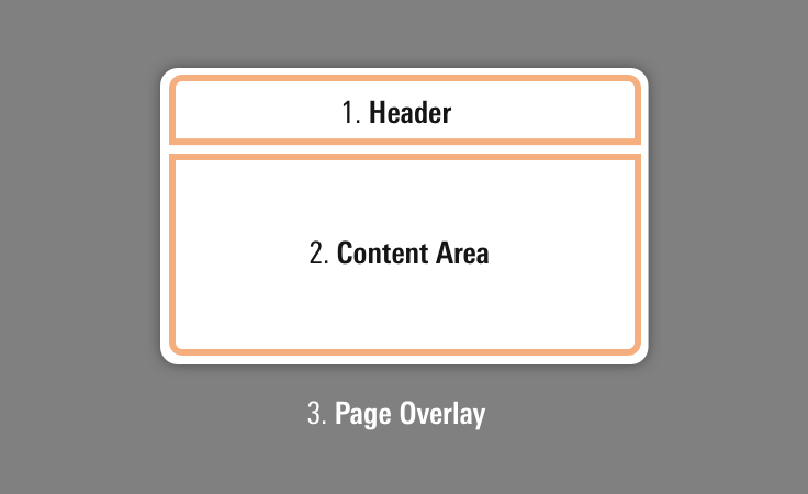 Anatomy of modal components.
- Additional icon controls should be placed to the left of the modal controls.
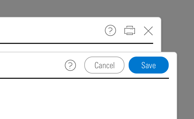 Place additional icons to the left.
- Consider applying a custom
z-indexvalue when you compose this component with other layered components, e.g., Dialogs, Tooltips, Popovers or Notifications to meet your product requirements.
Behaviors
- Once a modal reaches its maximum height, content will scroll within the container.
- Center modals horizontally and vertically in the viewport.
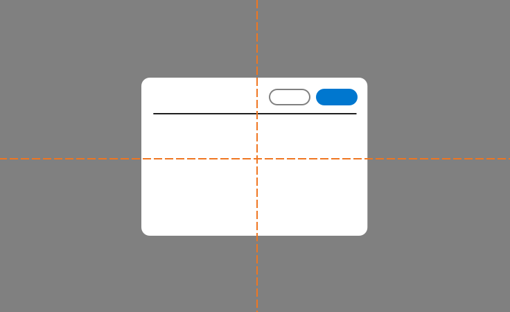 Modal alignment in viewport.
Editorial
Use title case for titles. (This means capitalize prepositions and conjunctions of four or more letters and all primary words.)
Dismissable Modals
- Titles should tell you what’s inside the modal. Consider using words from the link that launched the modal. Titles can also be questions.
- Content can scroll in the modal if need be, but the shorter, the better.
Action-is-Required Modals
- Titles should tell the user what they need to do. Consider starting with words from the link that launched the modal, and add other words to express a complete thought. Avoid questions.
- Content should tell users why they’re doing something, how to do it, and the consequences of not doing it, if applicable.
- Content can scroll in the modal if need be, but the shorter, the better.
Accessibility
- Add ARIA role
role=”dialog”to separate content from the rest of the page. - Add the
aria-labelledbyattribute in the same element as thedialogrole. This attribute references associated title markup to describe the modal and is the first item read by screen readers. Limit title length and avoid being too descriptive (i.e., “Do you want to save this?”); instead, use thearia-describedbyattribute, mentioned next. - Add an
aria-describedbyattribute for a more thorough description of the modal. For example, “You have made changes. What would you like to do?” - Add
aria-hidden=”true”attribute if the modal is hidden although present in DOM. - Lock and trap focus inside a modal using JavaScript when a modal is open.
- If a modal is triggered manually, return focus to the previous element (typically a button or link) once the modal is closed.
Code Reference
CSS Class References
|
Class |
Applies to |
Outcome |
|---|---|---|
|
|
|
Renders a 600px wide modal. |
|
|
|
Renders a 900px wide modal. |
|
|
|
Renders a 1200px wide modal. |
|
|
|
Invokes overlay and triggers visibility of modal. |
|
|
|
Starts animation of the modal. |
|
|
|
Opacity increased to |
|
|
|
Removes header borders and margins. |