Cards
- HTML/CSS Available
- Web Component Deprecated
- Last Updated
2.27.0
Cards provide a set of content which acts as an entry point to more detailed information.
Card
Anatomy
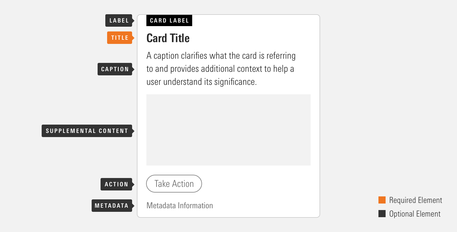
Cards can be configured in a variety of ways to accomplish their intended goal. Implementing teams are encouraged to use the particular set of elements which best serve their use case.
|
Name
|
Required
|
Description
|
|---|---|---|
|
Title |
Yes |
Briefly summarizes card content. |
|
Caption |
No |
Provides additional text to clarify or establish the card content. This element should not contain multiple paragraphs or links. |
|
Supplemental Content |
No |
Displays content such as images, Data Tables, or Charts. |
|
Action |
No |
Displays a single interactive UI component such as a Button or a Link. |
|
Label |
No |
Classifies the card to show its relationship to similar sets of information. |
|
Metadata |
No |
Provides additional information which helps a user gain a clear picture of the card’s content. |
Variations
Text First
Use when the textual content should be the initial focal point for a user’s attention.
Core Bond Funds


<div class="mds-card">
    <div class="mds-card__label">
        <div class="mds-card__label-title">Funds</div>
    </div>
    <h2 class="mds-card__title">
        Core Bond Funds
    </h2>
    <div class="mds-card__caption">These intermediate-term taxable-bond funds earn Morningstar Analyst Ratings of Gold.</div>
    <div class="mds-card__supplemental-content">
        <img src="/images/components/cards/[email protected]">
    </div>
    <div class="mds-card__action">
        <button class="mds-button mds-button" type="button">
            See Full List
        </button>
    </div>
</div>
<mds-card title="Core Bond Funds" label="Funds" caption="These intermediate-term taxable-bond funds earn Morningstar Analyst Ratings of Gold.">
<img slot="mds-card-supplemental-content" src="/images/components/cards/[email protected]">
<mds-button slot="mds-card-action" variation="secondary">See Full List</mds-button>
</mds-card>Supplemental Content First
Use when the supplemental content should be the initial focal point for a user’s attention.

U.S. Index Funds

<div class="mds-card">
    <div class="mds-card__supplemental-content">
        <img src="/images/components/cards/[email protected]">
    </div>
    <h2 class="mds-card__title">
        U.S. Index Funds
    </h2>
    <div class="mds-card__caption">Topnotch passive funds for the core of your domestic portfolio.</div>
    <div class="mds-card__action">
        <button class="mds-button mds-button" type="button">
            See Full List
        </button>
    </div>
</div>
<mds-card title="U.S. Index Funds" caption="Topnotch passive funds for the core of your domestic portfolio." supplemental-content-first>
<img slot="mds-card-supplemental-content" src="/images/components/cards/[email protected]">
<mds-button slot="mds-card-action" variation="secondary">See Full List</mds-button>
</mds-card>Full Bleed
Use for content which is most appropriately served by using the full width of the card, i.e., an image.
Core Bond Funds


Core Bond Funds


<div class="mds-card mds-card--full-bleed">
    <div class="mds-card__label">
        <div class="mds-card__label-title">Best Investments</div>
    </div>
    <h2 class="mds-card__title">
        Core Bond Funds
    </h2>
    <div class="mds-card__caption">These intermediate-term taxable-bond funds earn Morningstar Analyst Ratings of Gold.</div>
    <div class="mds-card__supplemental-content">
        <img src="/images/components/cards/[email protected]">
    </div>
    <div class="mds-card__action">
        <button class="mds-button mds-button" type="button">
            See Full List
        </button>
    </div>
</div>
<mds-card title="Core Bond Funds" caption="These intermediate-term taxable-bond funds earn Morningstar Analyst Ratings of Gold." label="Best Investments" full-bleed>
<img slot="mds-card-supplemental-content" src="/images/components/cards/[email protected]">
<mds-button slot="mds-card-action" variation="secondary">See Full List</mds-button>
</mds-card>- When using the label element with the HTML version of the full-bleed supplemental content first variation, always apply
mds-card--full-bleed-top-label-overlaptomds-card, ensuring that the label will overlap the supplemental content.
Link
Use when the card does not contain an action element and the whole card should act as a link.

<a class="mds-card mds-card--full-bleed" href="#">
    <div class="mds-card__label">
        <div class="mds-card__label-title">Best Investments</div>
    </div>
    <h2 class="mds-card__title">
        Core Bond Funds
    </h2>
    <div class="mds-card__caption">These intermediate-term taxable-bond funds earn Morningstar Analyst Ratings of Gold.</div>
    <div class="mds-card__supplemental-content">
        <img src="/images/components/cards/[email protected]">
    </div>
</a>
<mds-card title="Core Bond Funds" label="Best Investments" caption="These intermediate-term taxable-bond funds earn Morningstar Analyst Ratings of Gold." href="#" full-bleed>
<img slot="mds-card-supplemental-content" src="/images/components/cards/[email protected]">
</mds-card>- When a card contains an action element, the interaction should be tied to the UI component included there, not to the whole card.
Sizing
Sizing affects text size and internal padding. The default size is medium, and you can use modifier classes or props to make the card smaller or larger.
High-Yield Bonds
High-Yield Bonds

High-Yield Bonds


<div class="mds-card mds-card--small mds-card--full-bleed">
<div class="mds-card__label">
<div class="mds-card__label-title">Best Investments</div>
</div>
<h2 class="mds-card__title">
High-Yield Bonds
</h2>
<div class="mds-card__caption">Morningstar fund analysts’ favorites in this riskier area of the fixed-income market.</div>
<div class="mds-card__supplemental-content">
<img src="/images/components/cards/[email protected]">
</div>
<div class="mds-card__action">
<button class="mds-button mds-button--small" type="button">
See Full List
</button>
</div>
<div class="mds-card__metadata">10 Funds in List</div>
</div><mds-card size="small" title="High-Yield Bonds" label="Best Investments" caption="Morningstar fund analysts’ favorites in this riskier area of the fixed-income market." metadata="10 Funds in List" full-bleed>
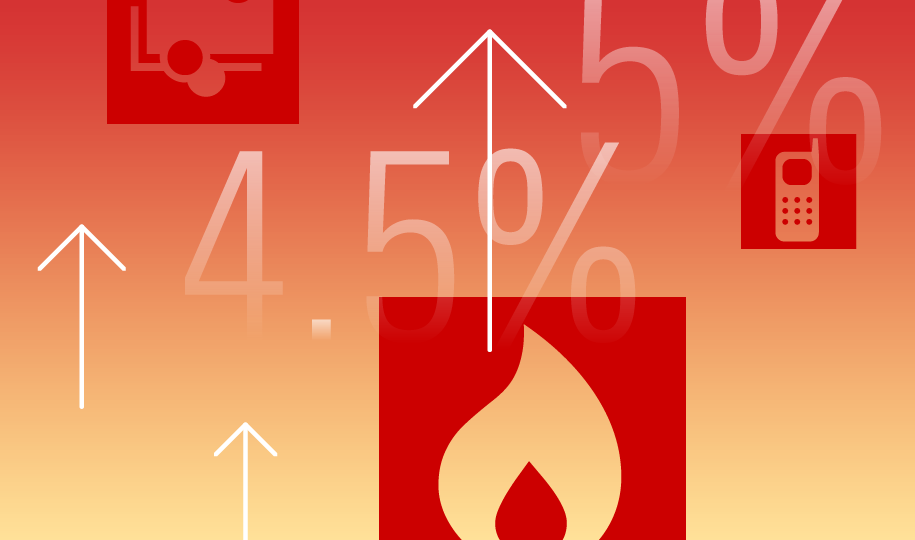
<img slot="mds-card-supplemental-content" src="/images/components/cards/[email protected]" alt="Illustration of Morningstar sector icons and upward facing arrows.">
<mds-button slot="mds-card-action" size="small" variation="secondary">See Full List</mds-button>
</mds-card>- Label and metadata maintain the same text size, styling, and spacing across all sizing variations.
- When including a Button in the action element, use the corresponding size variation, i.e., a large card should feature a large Button.
Use When
- Providing a summary of content as an entry point to a larger grouping of information.
Don’t Use When
- Grouping a large set of related information, instead, use a Module Container.
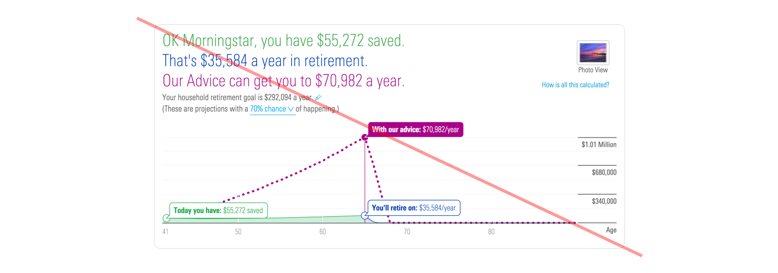 This group of content features too many interactions and is too large to utilize the card component.
- Layout or content customizations are required. Instead, use a Module Container to construct your component.
- Providing more than one kind of interaction. Cards should either be a link or contain a single action, like a Button or Link.
Visual Language
- Card dimensions are based on its content and the container in which it resides.
- Apply custom heights and width to meet product requirements.
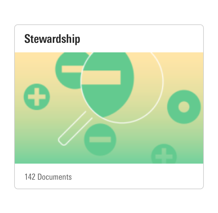
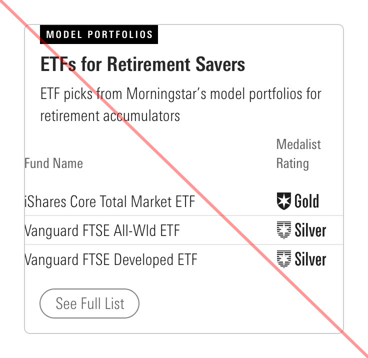
- When creating a group of cards which feature the Supplemental Content element, use consistently sized content across the entire group in order to drive consistency.
- When applying a custom color to a card’s label, pick a background color and text combination that meet color contrast accessibility standards.
Behaviors
- Cards should only contain a single action, which is tied to a UI component within the action element or to the whole card (using a card as a link).
Editorial
Label
- Keep labels one to three words long, if possible, to avoid wrapping.
Title
- Keep titles one to five words long, if possible, to avoid wrapping.
- Use title case and capitalize prepositions of four letters or more.
Caption
- Use full sentences with punctuation, no longer than 40 words if possible.
- Do not include multiple paragraphs.
Action
Metadata
- Keep metadata one to five words long to avoid wrapping.
CSS
Class References
|
Class
|
Applies to
|
Outcome
|
|---|---|---|
|
|
|
Adjusts styling to render a small card. |
|
|
|
Adjusts styling to render a large card. |
|
|
|
Removes padding on |
|
|
|
Changes display property of |
Web Component
Props
When setting props as attributes on a custom HTML element, use kebab-case instead of camelCase.
|
Prop
|
Type
|
Validation
|
Default
|
Description
|
|---|---|---|---|---|
|
|
String |
— |
— |
A space-separated list of class names that will be appended to the default |
|
|
String |
— |
— |
Sets the caption text of the card. |
|
|
Boolean |
— |
|
If |
|
|
Number |
Number in the range |
|
Sets the HTML heading level ( |
|
|
String |
The |
— |
Destination for the link card. When provide, transforms the entire card into a clickable link. Used only when the card does not contain an action link or button. |
|
|
String |
— |
— |
Sets the label text of the card. |
|
|
String |
— |
— |
Sets the metadata text of the card. |
|
|
String |
One of: |
|
Alters the size of the card. |
|
|
Boolean |
— |
|
If |
|
|
String |
Required |
— |
Sets the title text of the card. |
Slots
Default Slot
Pass text in between the <mds-card></mds-card> tags to set the card’s title text. This can be overridden with the title prop.
Named Slots
|
Slot Name
|
Description
|
|---|---|
|
|
|
|
|
Displays content, such as images, Data Tables, or Charts. |
Usage Examples
Setting title, metadata, and size via props. Using named slots for mds-card-supplemental-content:
<mds-card title="Hello World" size="small" metadata="Some metadata">
    <img slot="mds-card-supplemental-content" src="../some/image/path" alt="Alt text">
</mds-card>
Setting title and caption via props. Using named slots for mds-card-action:
<mds-card title="Hello World" caption="Example caption text.">
    <mds-link slot="mds-card-action" href="#">Link</mds-link>
</mds-card>Implementation
- When creating the
mds-card__titleof a card, teams should use the header tag (<h#>) which properly places the content within their product's information hierarchy. - When nesting other UI components within the action element of a card, always follow those components' accessibility guidelines.
- When applying a custom color to a card’s label, pick a background color and text combination that meet color contrast accessibility standards.

