Errors
Errors provide contextual and actionable feedback to help users resolve failures and avoid future complications.
Problem Statement
Errors disappoint and frustrate users. Prevent them whenever possible. When errors happen, provide thoughtful feedback and exemplify the conversations Morningstar strives to have with our users.
Types
System-level Errors
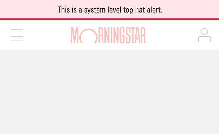
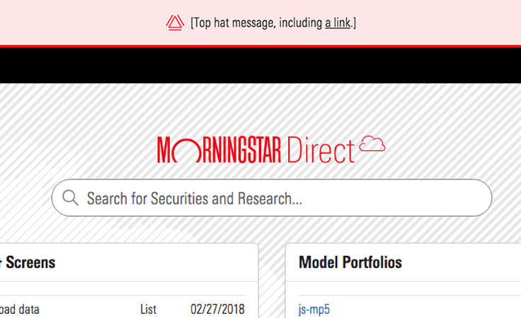
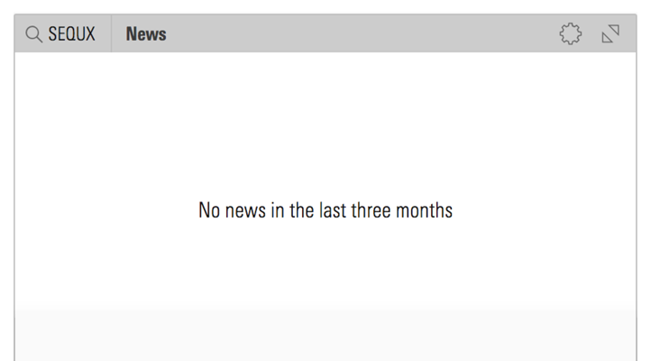
System-level errors should use the Top Hat component. In the message, start by apologizing, describe what’s going on, and indicate how long it might take to resolve the issue.
Page-level Errors
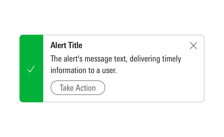
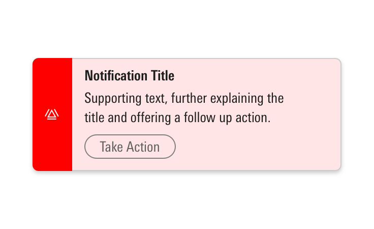
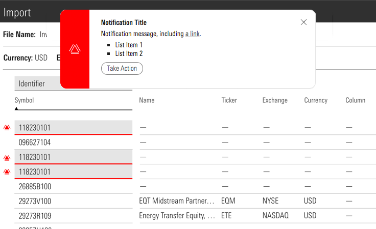
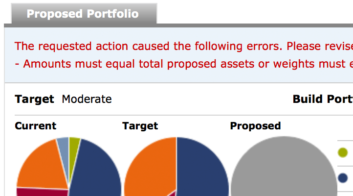
If there are errors about page-level or out-of-view events, use a Notification. Combine with inline form errors to further describe the error in detail.
See Forms, Notifications, and Tooltips for more information.
In-page Errors
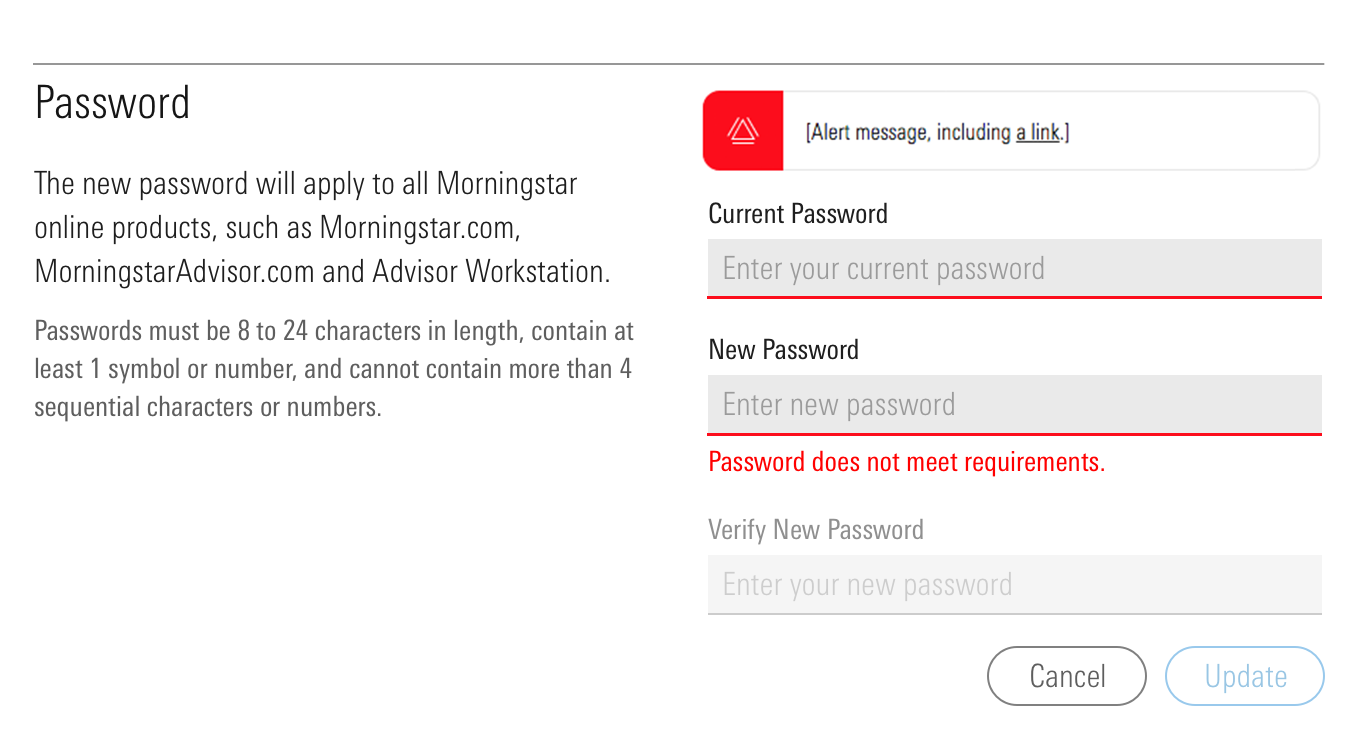
If there are errors at a component-level, Alerts can be used in combination with field-level validations to further describe the error in detail. Notifications are typically not necessary in addition to Alerts.
See Alerts, Forms, Notifications, and Tooltips for more information.
Inline Form Errors
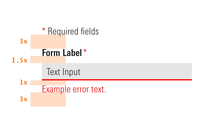
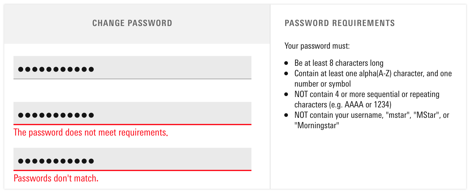
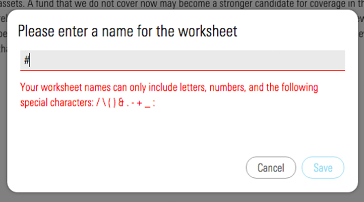
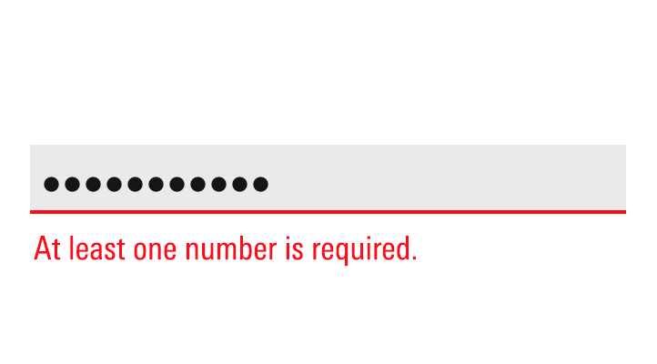
If a user enters an input incorrectly or fails to take proper action, alert them with red, in-line error messaging. Ideally, this messaging would show as the user types.
See Input states for details.
Permission Restricted Errors
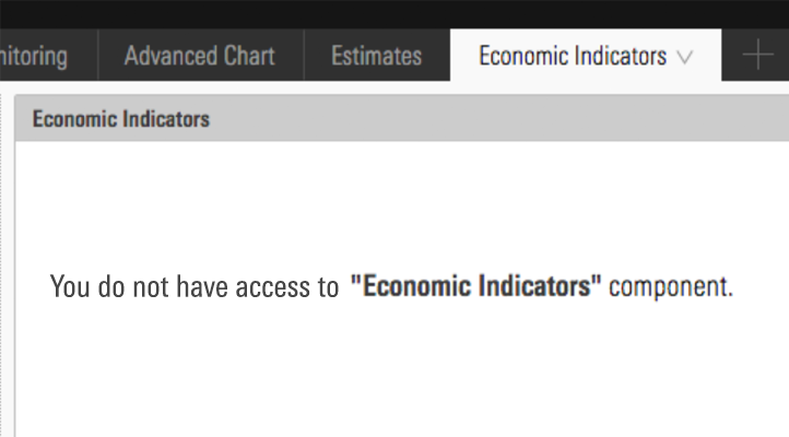
If a user can’t access certain information, tell them why, or hide the component entirely if it’s not pertinent to their role. Provide a way to resolve access issues, if it’s possible.
Preventative Measures
Deactivating Controls
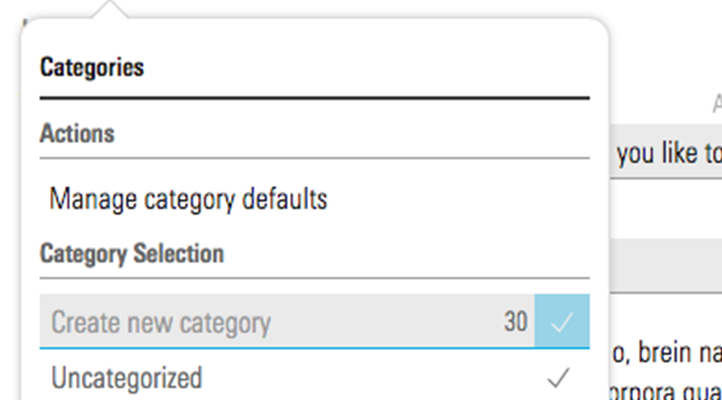
Character counters set users' expectations for how much content to enter, including any limits on characters.
Guidelines
Editorial
- Never make a user feel foolish, guilty or patronized. Use natural language to help them get out of whatever jam they’re in.
- Use full sentences with punctuation.
- Acknowledge what is keeping a user from proceeding, but don’t make them feel like they did something wrong.
- Provide a user at least one way to resolve the problem.
- Write it as if you were telling a friend how to resolve an issue.
- If an error has the potential to repeat, tell a user what they should do, i.e., “If the site continues to not recognize your account, email us at ___.”
Examples
This Sponsor Code is not valid
We don’t recognize this sponsor code. Check with your employer for more details.
Fix errors below
Enter the information below to reconnect your account.
Enter a valid Market Value.
For Market Value, enter only positive numbers.
Invalid investment exclusion.
You can’t exclude more than four investment options, because doing so will keep us from properly diversifying your account.
The security [Name] is already defined in client security master by security identifier as [ID]. Please either map the imported security to another Morningstar security or a user defined security.
You’ve already mapped an investment to this Morningstar security. Either choose another Morningstar security, or don't map it at all.
Enter balance
Enter only numbers between $0 and $100,000,000.
You’re not allowed to save that much into this account.
You’re saving more than
Invalid entry.
For this account, you can’t put in more than you make.


