Designing with MDS
The Morningstar Design System is a collection of brand, visual, UX, and technical standards built into a central library so that teams can quickly build high-quality, consistent experiences.
Overview
The system is organized into the sections listed below. Exploring these sections will help familiarize you with Morningstar design principles and patterns, and show you which existing components you can use in your product.
Visual Language
Visual Language contains the critical elements that define the look and feel of Morningstar products. Here, you will find details and guidelines on Color, Typography, Iconography, and Space, defined as reusable variables called Constants. Constants are threaded throughout MDS components to maintain a consistent visual style.
UI Components and Charts
UI Components and Charts provide reusable building blocks to solve common design challenges in Morningstar products. Because they are based on Morningstar Visual Language—and specifically leverage MDS Constants—these components often provide the quickest path to develop experiences consistent with Morningstar standards, and are the best place to start when adopting MDS. See UI Components for more information.
Editorial
Guidelines for ensuring that Morningstar’s voice remains trustworthy, friendly, and actionable.
UX Patterns
UX Patterns explain how to combine components to build usable, effective and holistic Morningstar experiences.
About MDS
About MDS includes a plethora of useful information on topics like Accessibility, Contributing to MDS, Reporting Bugs, and the MDS team’s Development Process.
Sketch Design Assets
This Sketch file contains visual language elements and pre-built designs for each MDS V2 component, defined as reusable symbols.
Stark Accessibility Plugin
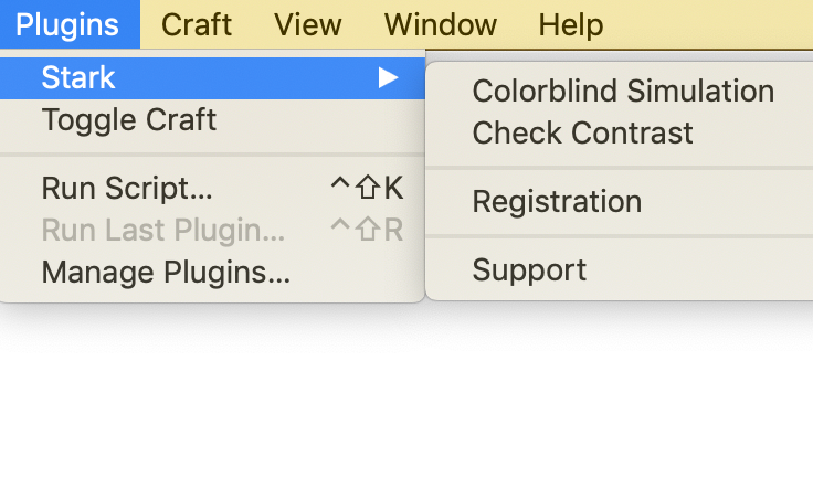
The Stark Sketch plugin allows users to check contrast in-app, as well as simulate how designs will be perceived by users with various forms of color blindness.
Follow the steps below to set up the Stark plugin within Sketch:
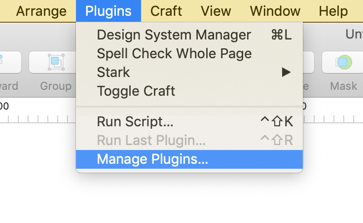
1. In Sketch, open the Plugins dropdown from the top toolbar.

2. Select Manage Plugins...
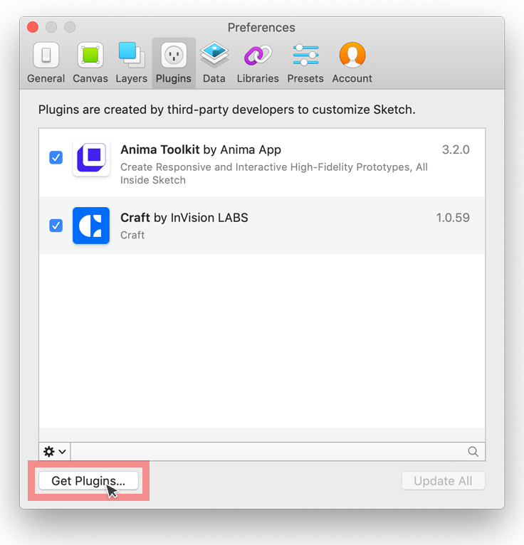
3. Select Get Plugin button in the bottom left-hand corner.

4. Search for and select the Stark plugin.
5. Click Download under the Sketch logo on the Stark homepage.
6. Unzip stark-sketch-plugin-master.zip
7. Open stark.sketchplugin
8. Stark will now be avilable to use through the Plugins dropdown from the top toolbar within Sketch.

Usage Tips
- The contrast checker within the Stark plugin works well but rounds to the nearest tenth of a decimal point. If the contrast ratio comes back as the desired ratio, 4.5:1 for normal text and 3:1 for large text, please double check the ratio with one of the online contrast checkers listed within the Accessibility section.
Icon Creation Templates
Use these Adobe Illustrator templates when creating new icons for MDS.
Brand Guidelines
Morningstar’s brand guidelines are documented on a separate documentation site where you can find details on topics such as:
- Brand philosophy
- Logo files and usage
- Print specifications
- Morningstar's intellectual property
- Presentation templates
- Event planning and design
The brand guide is password protected, if you need credentials to access these resources please reach out on Microsoft Teams in the Design channel or email [email protected].

