You are viewing legacy documentation. View the most recent documentation.

Iconography

Icons enhance Morningstar products by visually communicating meaning, actions, status, and feedback while helping to reduce cognitive load.

Component icons are used to construct controls and enhance other components.

  • These icons are interactive and generally have multiple states applied to them.
  • Many components—like Buttons, List Groups and Headers—account for the use of icons to enhance their display. See component documentation pages for details on using and sizing icons.
  • They’re available at two fixed sizes: Default and Small.
Example of icons from the MDS component icon set.

Available Icons

Default Size

alert
alert
bell
bell
bell-padless
bell-padless
bookmark
bookmark
bookmark-fill
bookmark-fill
bullhorn-padless
bullhorn-padless
caret-circle-down
caret-circle-down
caret-circle-left
caret-circle-left
caret-circle-right
caret-circle-right
caret-circle-up
caret-circle-up
caret-down
caret-down
caret-left
caret-left
caret-right
caret-right
caret-up
caret-up
chat-bubble
chat-bubble
check
check
clock
clock
clock-back
clock-back
collapse
collapse
create-padless
create-padless
crosshair
crosshair
cursor
cursor
dash-horizontal
dash-horizontal
dash-vertical
dash-vertical
document
document
download
download
download-cloud
download-cloud
ellipsis-circle
ellipsis-circle
ellipsis-horizontal
ellipsis-horizontal
ellipsis-vertical
ellipsis-vertical
envelope
envelope
exclaim
exclaim
exclaim-circle-fill
exclaim-circle-fill
expand
expand
eye
eye
file-cabinet-padless
folder-close
folder-close
funnel
funnel
funnel-fill
funnel-fill
gear
gear
grab-handle
grab-handle
group
group
group-column
group-column
group-row
group-row
hand
hand
heart
heart
home
home
home-padless
home-padless
import
import
info-circle
info-circle
info-circle-fill
info-circle-fill
jump-column
jump-column
list
list
lock-close
lock-close
lock-open
lock-open
marker
marker
marker-fill-padless
marker-fill-padless
marquee-select
marquee-select
marquee-zoom
marquee-zoom
menu-padless
menu-padless
minus
minus
news
news
object-plus
object-plus
open-new
open-new
paperclip
paperclip
paperclip-angle
paperclip-angle
pause-circle
pause-circle
pencil
pencil
person
person
person-group
person-group
person-padless
person-padless
person-plus
person-plus
play-circle
play-circle
plus
plus
print
print
question-circle
question-circle
question-circle-padless
refresh
refresh
remove
remove
save
save
scale
scale
search
search
search-list
search-list
search-padless
search-padless
share
share
stop-circle
stop-circle
text-size
text-size
trash
trash
triangle-fill-down
triangle-fill-down
triangle-fill-left
triangle-fill-left
triangle-fill-right
triangle-fill-right
triangle-fill-up
triangle-fill-up
undo
undo
upload
upload
wrench-padless
wrench-padless

Small Size

alert--s
alert--s
alert-fill--s
alert-fill--s
angle-double-down--s
angle-double-left--s
angle-double-right--s
angle-double-up--s
angle-double-up--s
angle-down--s
angle-down--s
angle-left--s
angle-left--s
angle-right--s
angle-right--s
angle-up--s
angle-up--s
bell--s
bell--s
bookmark--s
bookmark--s
bookmark-fill--s
bookmark-fill--s
caret-circle-down--s
caret-circle-left--s
caret-circle-right--s
caret-circle-up--s
caret-circle-up--s
caret-down--s
caret-down--s
caret-left--s
caret-left--s
caret-right--s
caret-right--s
caret-up--s
caret-up--s
chat-bubble--s
chat-bubble--s
check--s
check--s
clock--s
clock--s
document--s
document--s
download--s
download--s
ellipsis-circle--s
ellipsis-circle--s
ellipsis-horizontal--s
ellipsis-vertical--s
envelope--s
envelope--s
exclaim--s
exclaim--s
exclaim-circle-fill--s
expand--s
expand--s
eye--s
eye--s
folder-close--s
folder-close--s
funnel--s
funnel--s
funnel-fill--s
funnel-fill--s
gear--s
gear--s
grab-handle--s
grab-handle--s
heart--s
heart--s
home--s
home--s
import--s
import--s
info-circle--s
info-circle--s
info-circle-fill--s
info-circle-fill--s
list--s
list--s
lock-close--s
lock-close--s
lock-open--s
lock-open--s
minus--s
minus--s
open-new--s
open-new--s
pause-circle--s
pause-circle--s
pencil--s
pencil--s
person--s
person--s
person-group--s
person-group--s
person-plus--s
person-plus--s
play-circle--s
play-circle--s
plus--s
plus--s
question-circle--s
question-circle--s
remove--s
remove--s
save--s
save--s
search--s
search--s
share--s
share--s
trash--s
trash--s
triangle-fill-down--s
triangle-fill-up--s
triangle-fill-up--s
undo--s
undo--s
upload--s
upload--s

Design Approach

Icon Grid

Simple, clear, and consistent icons require the rigor of underlying grid.

Construction & Visual Style

Icons use simple geometric shapes and 1-pixel strokes.

Example of the geometric shapes used to construct the gear icon.
Example of the geometric shapes used to construct the gear icon. Figure 1. Design process for the `gear` icon.

The gear icon is an excellent example of a complex icon that is derived from simple geometric shapes. The grid guides the positioning of the shapes. Once on the grid, those shapes are refined and combined. Removing what isn’t necessary allows the icon’s essential form to shine through.

When designing a new icon, always consider it in the context of the entire icon family. For example, the gear icon is more complex than others, but following our construction and style guidelines allow it to harmoniously pair with others.


The gear icon compared to other existing icons.
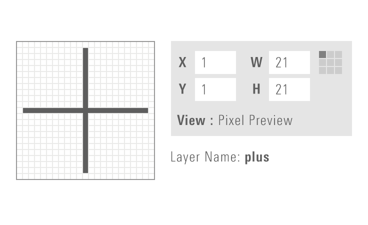
Plus icon using proper visual style.
Do use right angles, a consistent 1-pixel stroke, and square terminals.
Plus icon using incorrect visual style.
Don‘t use an inconsistent stroke and rounded terminals.
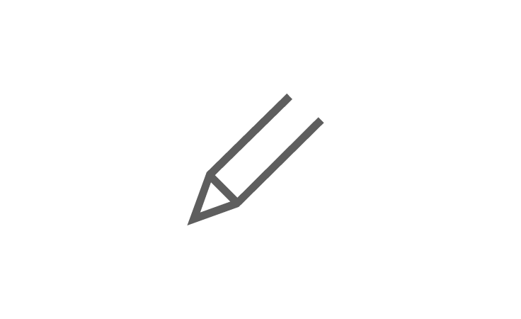
Pencil icon drawn with minimal detail.
Do use minimal detail to reduce the icon to its essential form.
Pencil icon drawn too much detail.
Don‘t add superfluous detail to the icon from.
Plus icon snapping to grid in Illustrator.
Do enable “Pixel Preview” and “Snap to Grid” when creating new icons.
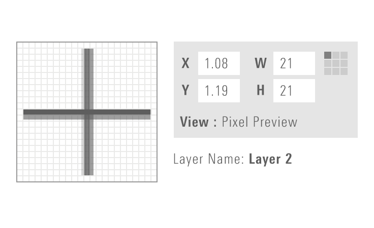
Plus icon showing sub-pixel rendering when not snapped to grid.
Don‘t place artwork off the pixel grid when creating new icons.

Saving Icon Artwork as SVG

To ensure that icon artwork is optimized to work with the MDS iconography system, always take the following steps when saving individual icons as files.

1. Create your artwork using the appropriate Adobe Illustrator icon template file. Place your icon on the Artwork layer and make sure to save a pre-production version of your file.

2. In the Layers palette, delete all but the Artwork layer.

Screenshot showing the guides and shapes layers in Illustrator. Layers palette in Illustrator.

3. Outline all strokes, and use the Unite option in the Shape Modes section of the Pathfinder tool to convert the icon to a compound shape.

Screenshot showing the unite pathfinder tool in Illustrator. Pathfinder tool in Illustrator

4. Select the compound shape and set the fill to solid black #000000.

5. Save as an SVG.

Deselect the following in the "SVG Options" dialog:

  • Preserve Illustrator Editing Capabilities
  • Responsive (Under "More Options")
Screenshot showing the svg options dialog in Illustrator. SVG Options dialog in Illustrator.

6. Optimize the SVG using SVGOMG:

  1. Upload your pre-optimized SVG
  2. Leave all settings at their default
  3. Save your optimized SVG

7. Confirm that the SVG file contains no irrelevant code by opening the .svg file in any text editor. It should not contain any references to Adobe Illustrator, hex codes, or class or id names. For example:

<svg xmlns="http://www.w3.org/2000/svg" width="23" height="23" viewBox="0 0 23 23"><path d="M20 19.3l-4.9-4.9c1.2-1.3 1.9-3.1 1.9-5 0-4-3.4-7.4-7.5-7.4S2 5.4 2 9.5 5.4 17 9.5 17c1.9 0 3.6-.7 4.9-1.8l4.9 4.9.7-.8zM3 9.5C3 5.9 5.9 3 9.5 3S16 5.9 16 9.5 13.1 16 9.5 16 3 13.1 3 9.5z" /></svg>

The icon artwork is now ready for use in MDS.

Custom Icons

Custom Icons Not in MDS

If your product team uses custom icons that are not included in MDS, you should implement them within your own application using the same SVG sprite method as the System. To ensure that your custom icons are optimized for the MDS, use the saving icon artwork as SVG process.

Adding Custom Icons to MDS

If you believe that custom icons in your product should be added to MDS, first identify one or more additional teams that have a need for the icon. Ensure that your custom icon follows our design approach and prepare your icon artwork using the saving icon artwork as SVG process.

Submit the icon to be added to MDS by speaking to Jonathan Duncan, the iconography segment owner, or by emailing [email protected]. Once the new icon has been reviewed, the System team will work with you to include the new icon in an upcoming release.

IP icons represent Morningstar’s intellectual property and should not be used to represent anything other than their established meanings. For example, the star-rating icon represents the Morningstar Star Rating and the style-box icons are used to communicate the investment style of a group of holdings.

  • They’re available at two fixed sizes: Default and Small.
  • Some IP icons are only available in the Morningstar Symbols font, see the Typography page for more information.

Available Icons

Default Size

performance-arrow-down
performance-arrow-up
pillar-negative
pillar-negative
pillar-neutral
pillar-neutral
pillar-positive
pillar-positive
quartile-empty
quartile-empty
quartile-first
quartile-first
quartile-fourth
quartile-fourth
quartile-second
quartile-second
quartile-third
quartile-third
sector-basic-materials
sector-communication-services
sector-consumer-cyclical
sector-consumer-defensive
sector-energy
sector-energy
sector-financial-services
sector-healthcare
sector-healthcare
sector-industrials
sector-industrials
sector-real-estate
sector-real-estate
sector-technology
sector-technology
sector-utilities
sector-utilities
size-aggregate-large-cap
size-aggregate-mid-cap
size-aggregate-small-cap
star-rating
star-rating
star-rating-hypo
star-rating-hypo
style-aggregate-core
style-aggregate-growth
style-aggregate-value
style-box
style-box
style-box-bottom-left
style-box-bottom-mid
style-box-bottom-right
style-box-middle-left
style-box-middle-mid
style-box-middle-right
style-box-top-left
style-box-top-left
style-box-top-mid
style-box-top-mid
style-box-top-right
style-box-top-right
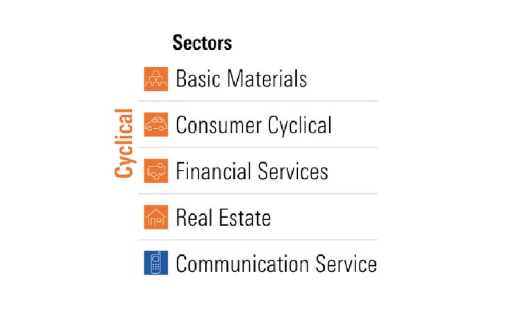
super-sector-cyclical
super-sector-defensive
super-sector-sensitive
sustainability
sustainability

Small Size

performance-arrow-down--s
performance-arrow-up--s
pillar-negative--s
pillar-negative--s
pillar-neutral--s
pillar-neutral--s
pillar-positive--s
pillar-positive--s
quartile-empty--s
quartile-empty--s
quartile-first--s
quartile-first--s
quartile-fourth--s
quartile-fourth--s
quartile-second--s
quartile-second--s
quartile-third--s
quartile-third--s
sector-basic-materials--s
sector-communication-services--s
sector-consumer-cyclical--s
sector-consumer-defensive--s
sector-energy--s
sector-energy--s
sector-financial-services--s
sector-healthcare--s
sector-industrials--s
sector-real-estate--s
sector-technology--s
sector-utilities--s
sector-utilities--s
size-aggregate-large-cap--s
size-aggregate-mid-cap--s
size-aggregate-small-cap--s
star-rating--s
star-rating--s
star-rating-hypo--s
star-rating-hypo--s
style-aggregate-core--s
style-aggregate-growth--s
style-aggregate-value--s
style-box--s
style-box--s
style-box-bottom-left--s
style-box-bottom-mid--s
style-box-bottom-right--s
style-box-middle-left--s
style-box-middle-mid--s
style-box-middle-right--s
style-box-top-left--s
style-box-top-mid--s
style-box-top-right--s
super-sector-cyclical--s
super-sector-defensive--s
super-sector-sensitive--s
sustainability--s
sustainability--s

Illustrative icons are used to bring meaning and visual interest to a page.

  • These icons don’t provide functional interaction.
  • Pair and build off these icons to make illustrative compositions.
  • They’re useful for marketing, empty states, and other types of content.
  • They can be scaled to accommodate any chosen format.
Example of icons from the MDS illustrative icon set.

Design Approach

Illustrative icons are designed on a 72x72px (1x1in) artboard using 1px strokes.

Clear and intuitive metaphors are critical. Be thoughtful with your intent and ask yourself if the icon clearly represents the form of the object or idea.

Consider these icons as a starter set; don’t feel restricted by what’s currently available. If you find that an icon doesn’t suit your needs, contribute a change to MDS or consider a variant set.

Icon Grid

The icon grid is meant to guide, not be prescriptive. Don’t force an object on the grid if it’s optically unbalanced or conflicts with the object’s natural form.

Use the keylines to help maintain consistent proportions. These represent the most common shapes and proportions found in our current icons: Circle, Square, Tall, and Wide.

The illustrative icon template key lines. The illustrative icon grid, including keylines and guides for maintaining consistent shapes and proportions.

Taller icons tend to hit the top and bottom outermost keylines and are often slimmer in width.

Example of a tall person icon appropriately using the top and bottom keylines. An example of a tall icon utilizing the top and bottom outermost keylines.

Wider icons tend to hit the left and right outermost keylines and can be shorter in height.

Example of a wide envelope icon appropriately using left and right keylines. An example of a wide icon utilizing the left and right outermost keylines.

In some cases, icons may need to extend beyond the keylines in order to fix proportions.

Example of a very wide icon of cash expanding appropriately beyond the left and right keylines. An example of an icon extending beyond keylines to fix proportions.

Use square butt-cap and miter joint strokes.

Screenshot showing selection of square butt-cap and miter joints in Illustrator. Proper configuration of strokes in Adobe Illustrator.

Construction & Visual Style

Formal Relationships

Look for similar curves, shapes, or patterns of detail within the existing icons that can further inform the visual language.

Examples of common shapes replicated across different icons, like curves, horizontal lines and waves. Replicating curves, shapes and patterns unifies the visual language of our icons.

Systemic families are conceptually linked ideas. It can be helpful to consider visual anchors to strengthen their meaning as a group.

Example showing replication of the shape of a door across many structures, and one example where not replicating makes sense. While using visual anchors can help strengthen a group of related icons, remember to remain true to the icon. For example, the courthouse does not have a door because adding one took away from its optimal visual clarity.

Stay true to the visual nature of the object when deciding to use sharp or rounded corners.

Example showing a piece of paper and credit card icon using border radii that match their true nature. In this example, sharp corners work best to represent the true nature of a piece of paper, while rounded corners maintain the true nature of a credit card.

When do I use breaks?

Use breaks to heighten moments of depth and overlap, show dissimilarity between material, or to add texture.

There can be instances where these rules don’t apply. Use your best judgement and always consider if a break helps or hinders the clarity of the icon.

Don’t arbitrarily use breaks for design flourish. Be thoughtful in its application.
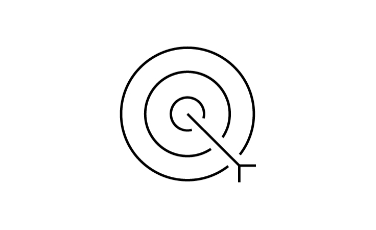
An icon of an arrow in a target, using line breaks to show depth.
Do use to show the illusion of depth in a two-dimensional plane.
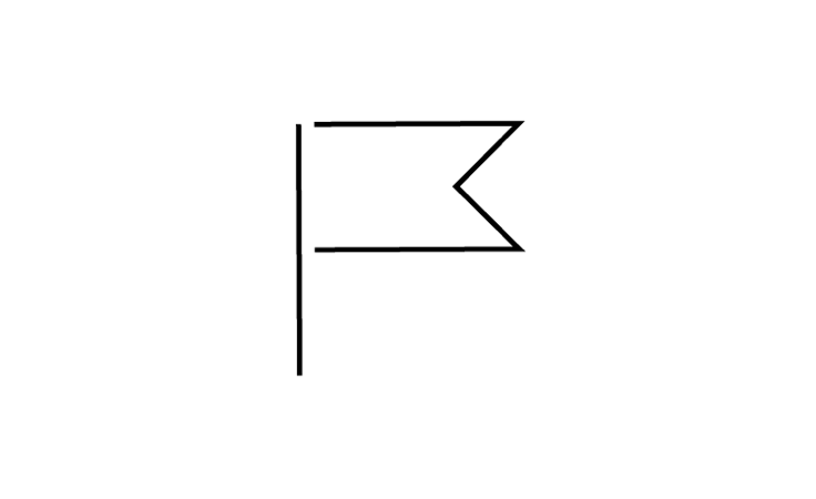
An icon of a flag, using line breaks to show the separation of flagpole and fabric.
Do use to show dissimilarity, like the fabric of a flag against the solid material of the flagpole.
An icon of a stack of papers, using line breaks to show depth.
Do use to show overlapping and layering to create a nice moment of texture.

Visual Styles

You can apply visual styles (i.e., color, gradients, shapes) to add cohesion and personality to your icons.

If you are applying a treatment to your icons, maintain the same treatment throughout your product’s experience (example: presentation, article, interface). Only deviate where it makes the most sense.

Best Practices

Scaling

Illustrative icons can be scaled appropriately to fit the needs of your chosen format.

Be aware of the icon’s size and adjust the stroke width to match its proportion. It’s important to maintain a light and thin aesthetic when scaling.

In digital format, the minimum stroke width is 1px.

Example of stroke weight scaling with an icon in Illustrator. Consider using “Scale Strokes & Effects” in Illustrator to automatically retain stroke proportions while scaling.

When paired in line with text, the icon’s stroke must be proportional to the weight of the type.

Example of lightbulb icon strokes scaled to match the typography they are paired with. Examples of adjusting an icon’s stroke weight to match paired text.

Available Icons

Grid displaying all available illustrative icons. Our current set of standard illustrative icons.

IP Icons

Grid displaying all illustrative Morningstar intellectual property icons, like our star rating and stylebox. Our current set of IP illustrative icons.
Example of multiple illustrative IP icons arranged to create a unified illustration.
Do use illustrative IP icons to represent the idea of our IP data.
Example of illustrative IP icons inappropriately used in a data table component.
Don‘t use within real-world examples such as tables, charts, research, or other data-driven needs. Use component icons or the Morningstar symbols font when referencing our actual data.
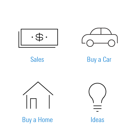
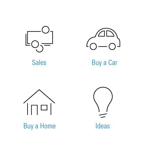
Example of illustrative icons used to show general idas like cash, automobile, home, and ideas.
Do use standard icons for generic, non-proprietary metaphors.
Example of IP illustrative icons inappropriately used to represent generic concepts instead of proprietary Morningstar concepts.
Don‘t use IP illustrative icons for generic, non-proprietary metaphors.

Custom Icons

What if the icon you’re looking for doesn’t exist?

If your product requires an icon that doesn’t exist, you’re encouraged to create the icon and contribute it to the system for others to use. Please reach out to Jonathan Duncan to request a review with the Visual Design community.

Saving a Custom Illustrative Icon

If you’re creating a new icon or saving an existing icon, discuss the best format to save your icon with your team. You should consider the medium (print or digital) and the final size.

Contributing Icons to MDS

If you believe that custom icons in your product should be added to MDS, first identify one or more additional teams that have a need for the icon. Ensure that your custom icon follows our design approach, and prepare your icon artwork using the appropriate process to save it (mentioned above).

To submit your icon to MDS for review, speak to Jonathan Duncan, the iconography segment owner, or email [email protected]. Once the new icon has been reviewed, the MDS team will work with you to include the new icon in an upcoming release.